The Works of F. Scott Fitzgerald
Objective:
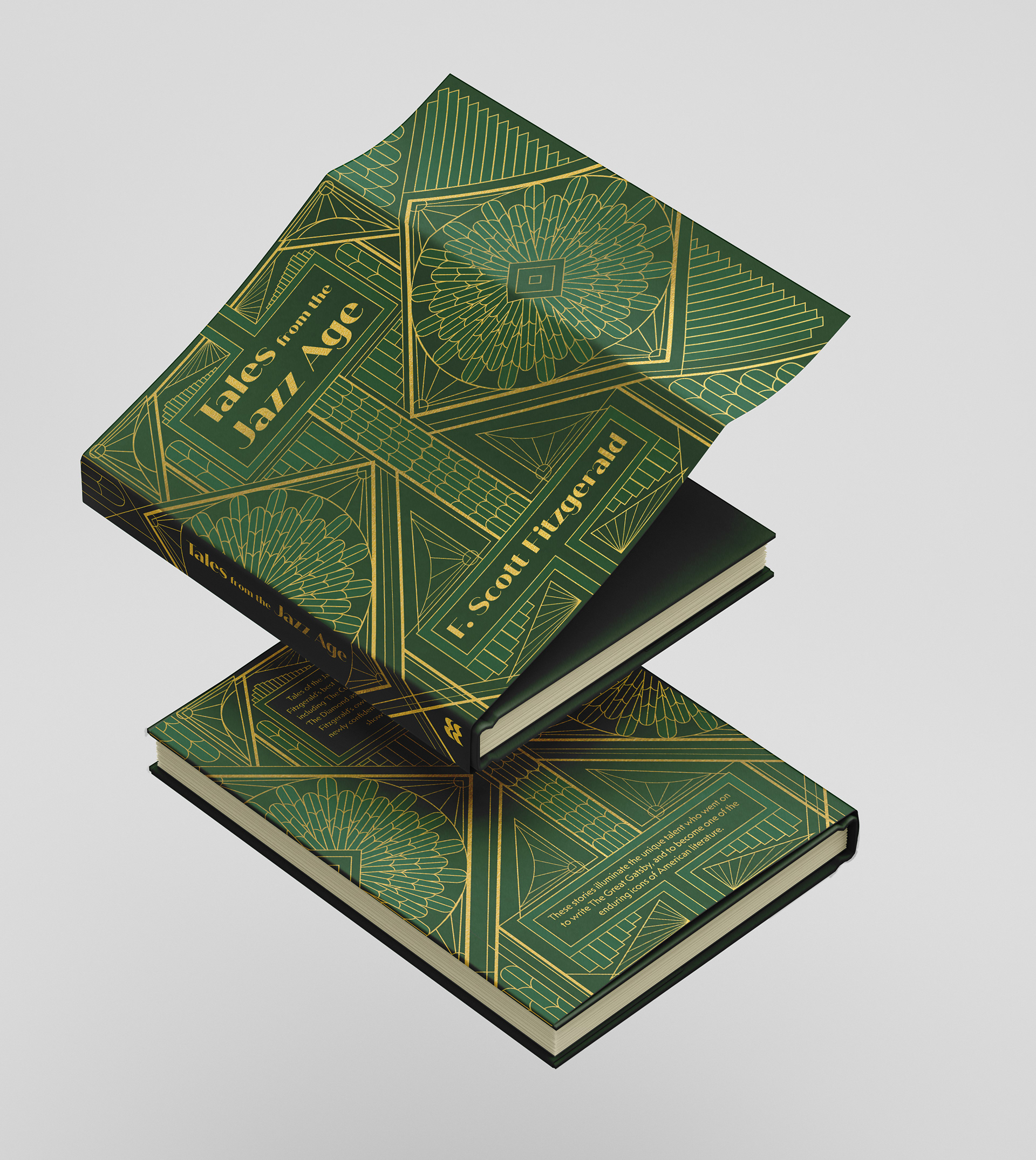
Create a book cover for Tales of the Jazz Age that captures the allure of the Roaring Twenties and celebrates F. Scott Fitzgerald’s narratives.
Deliverables:
• A cohesive dust jacket design, including front, back, spine, and interior flaps.
• Art Deco-inspired motifs, typography, and layout, combining elegance and readability.
• A complete back cover with copy, barcode, and ISBN, integrated seamlessly within the Art Deco design.

Design process:
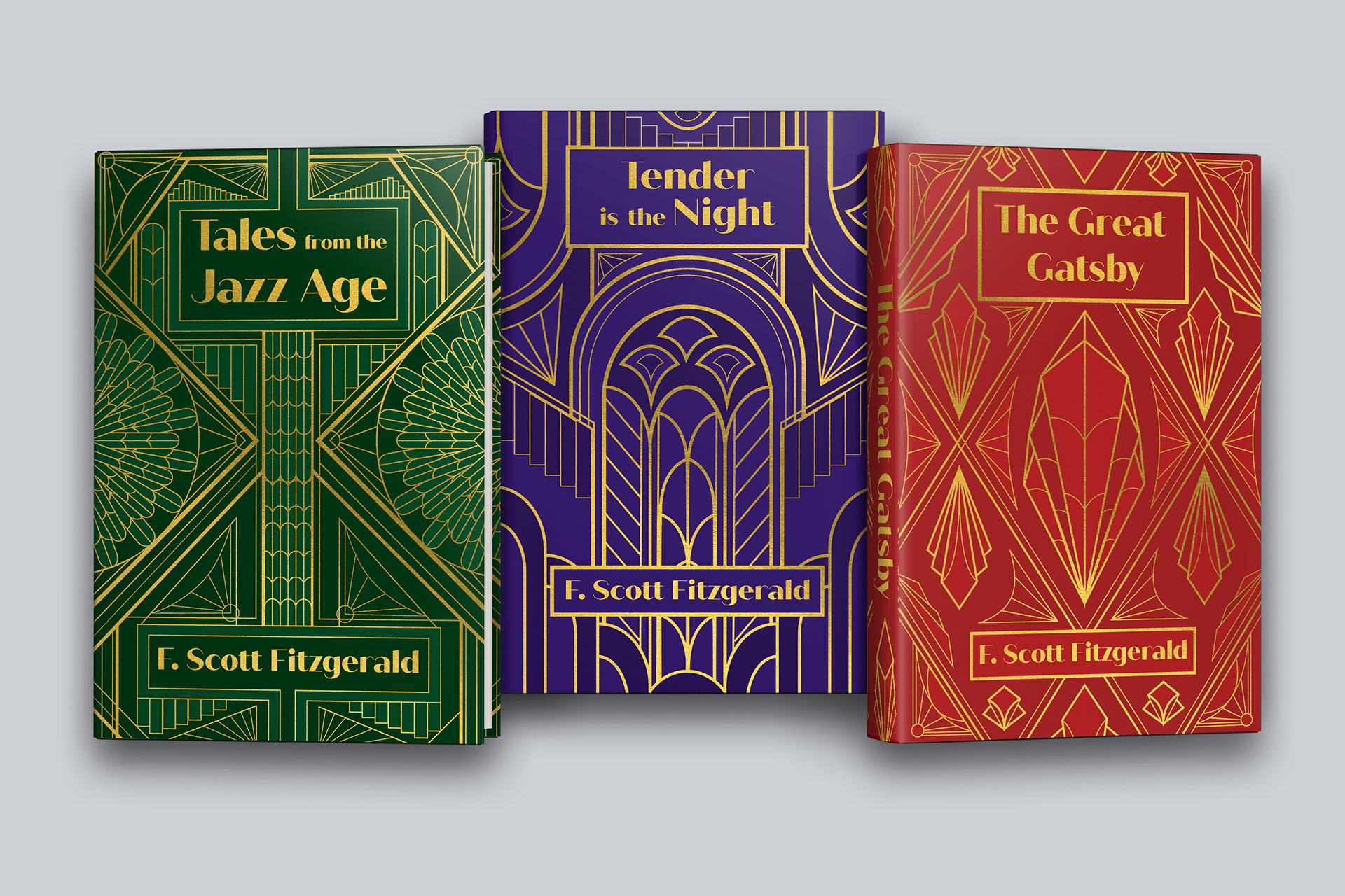
This is one of my favorite projects that I’ve worked on. Created in a History of Graphic Arts class during my undergraduate degree, the Tales of the Jazz Age book cover in green was my first real foray into experimenting with the Art Deco style. I so enjoyed the process that I later created the red and blue covers on my own time to accompany the first one.
Inspiration images sourced from Pinterest for reference purposes only.

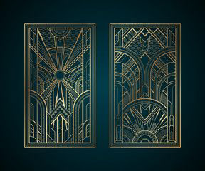


Art Deco in many ways is a snowball effect of art movements, pulling from Cubism, Fauvism, ballet, the mythologies of ancient Egypt and Greece, and exoticized interpretations of Persian and Indian cultures. It was lavish, glamorous, and progressive, all themes familiar to anyone who has read any of F. Scott Fitzgerald’s stories.
Amongst this wealth of inspiration, I chose to focus on the geometric patterns, rich gold accents, and balanced symmetry present in classic Art Deco pieces from posters to architecture. Diamonds, arches, and fan motifs capture the era’s luxurious feel, while symmetrical layouts bring a sense of order and elegance, evoking the timeless magnetism of the Jazz Age.
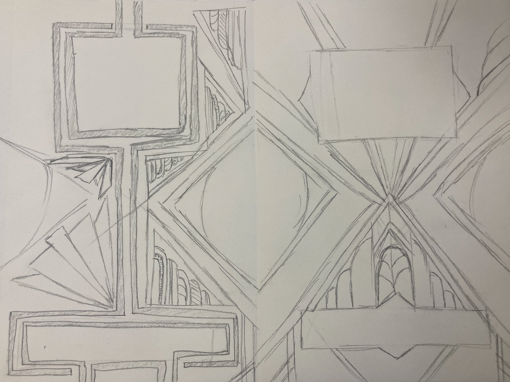
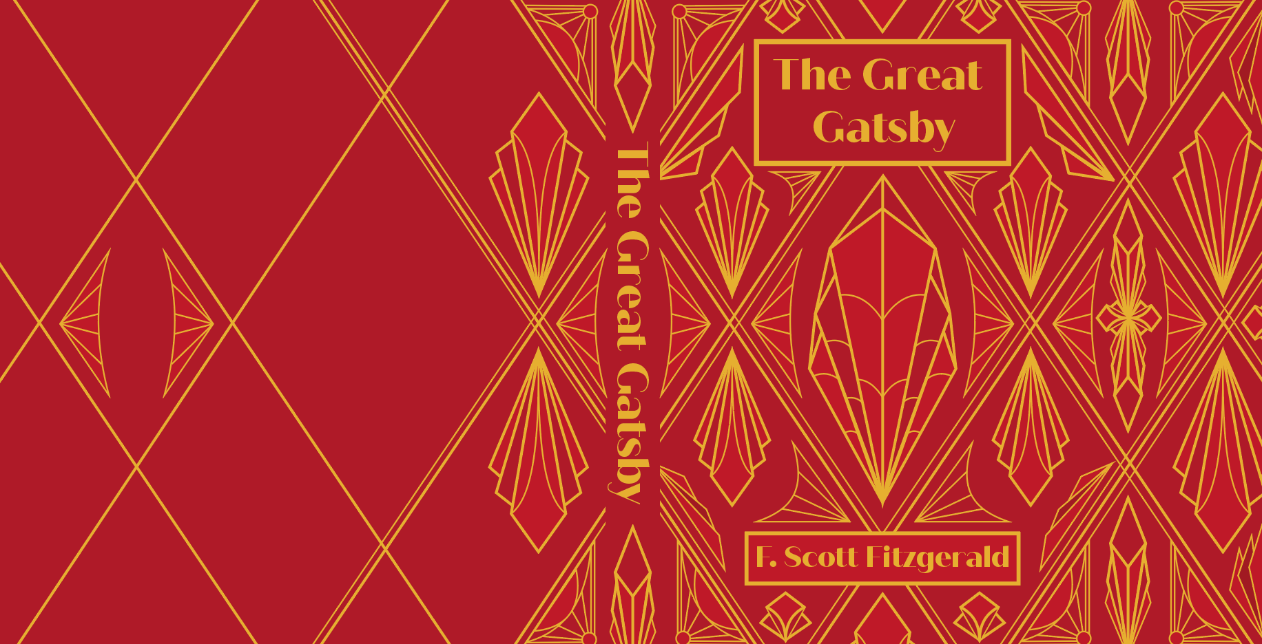
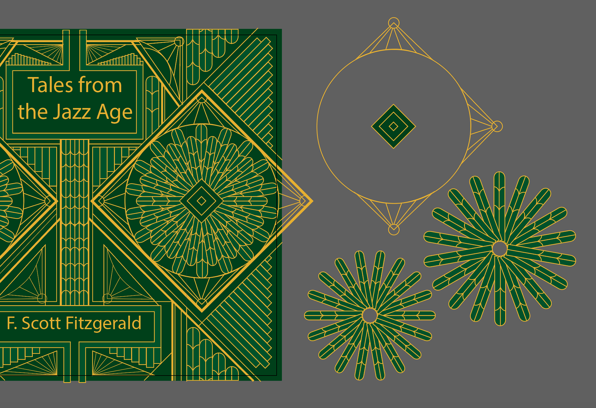
To create this first cover, I started by building basic motifs common to Art Deco era works such as the corner sunburst, the geometric stairsteps, and round arches. With these pieces gathered, I simply started to play, puzzling them together as I experimented with angles, opposites, and added linework until I had discovered the central focal point with surrounding patterns flowing out from it. Balancing open space with intricate patterns was key to maintaining visual interest and clarity, which was aided by flat, complementary colors that add vibrancy while adhering to Art Deco’s stylized approach.
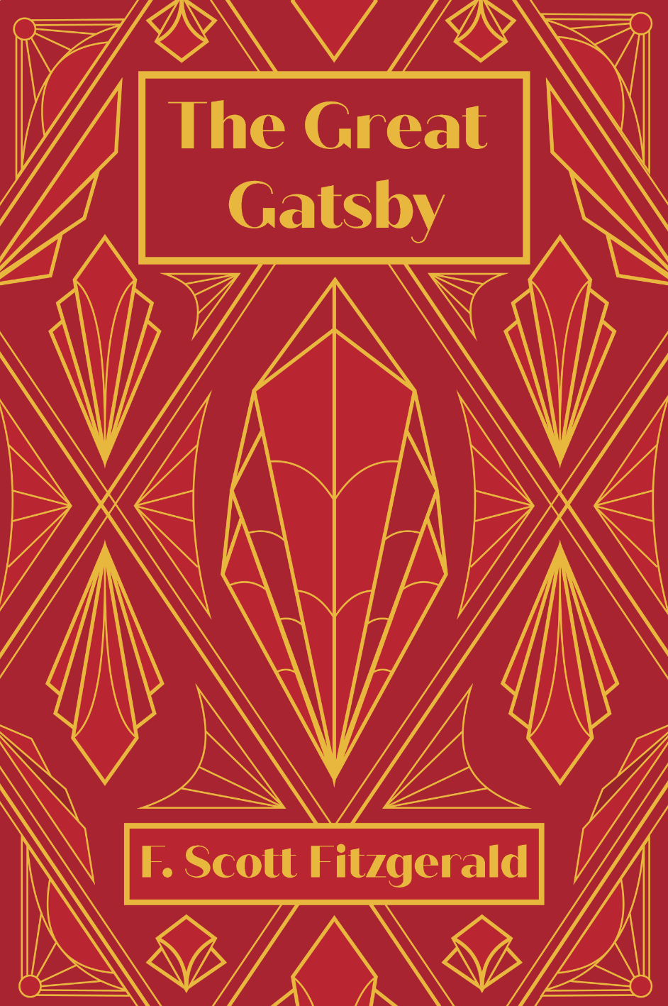

The process for the red and blue covers was very similar, however I wanted to make sure that they retained similarity with the first cover without losing their individuality. Since the green cover was balanced around repeating square diamonds with small arches in a fan, I chose to lean into larger arches and a more rounded aesthetic for the blue cover and on the other end a more angular approach for the red one.
These additional covers complete the set, creating a trio of vibrant colors in a rich visual playground with potential for gold foiling to elevate the design into a collector’s item. Together, these elements lead the viewer’s eye from front to spine to back and capturing the timeless spirit of the Roaring Twenties.