ObjectivE:
Typography stands as a cornerstone of graphic design, wielding immense power in communication. Select and research one typeface, highlighting its historical context and exploring why it holds pivotal importance today.
Deliverables:
Craft a visually engaging poster that serves as a showcase for the selected typeface
Written analysis of 300 words or more, all of which must be contained within the visual format
Seamlessly integrate the written report into the poster design, creating a cohesive narrative that highlights the typeface's key attributes and historical context.
Bibliography of 5 or more authoritative sources, all of which must be contained within the visual format
Process
I began this project by creating a small list of fonts I appreciated and searching for resources on each. While I initially chose to research Dunbar, I struggled to find enough detailed information on its creation. Baskerville however, created in 1757, has a long and rich history. During the research and writing phase I also began experimenting with poster layouts.
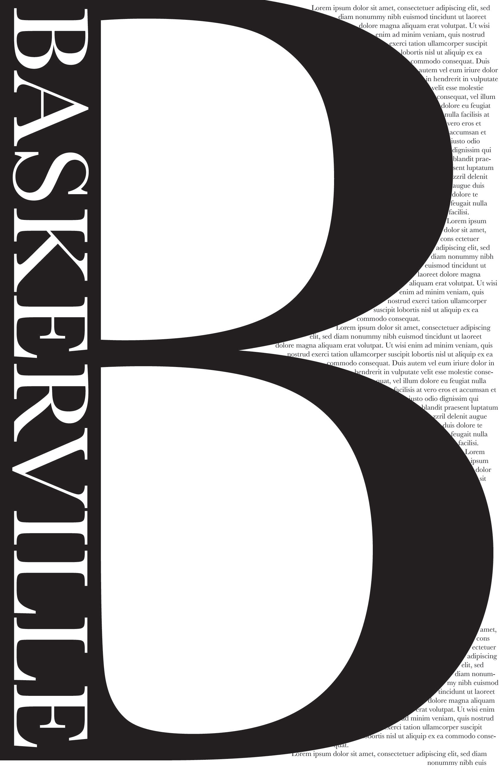
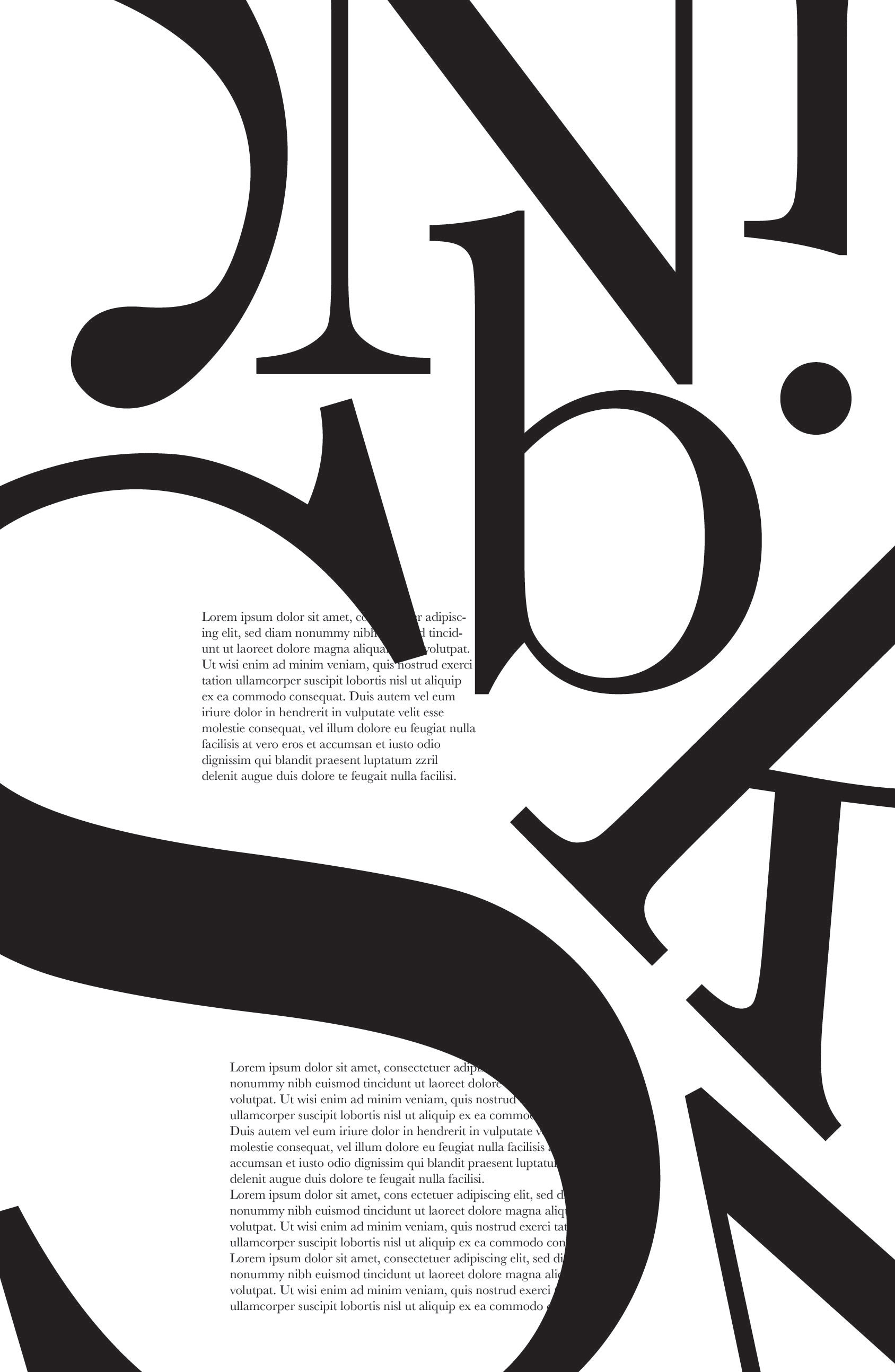
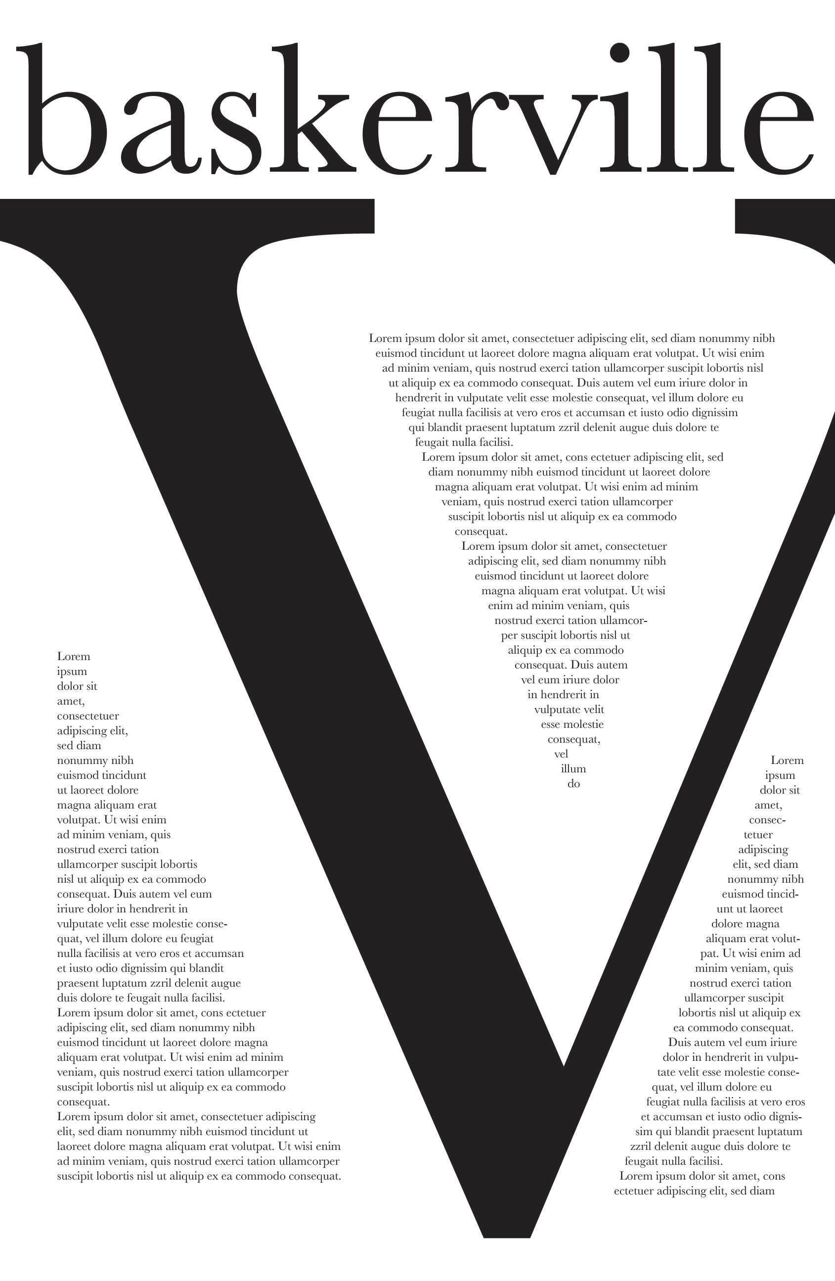
As with any project, some of the drafts were better than others. I found that the layouts playing with setting the body copy into the cavities and counters of the Baskerville typeface were the most interesting, as they tended to have more of a figure ground relationship.
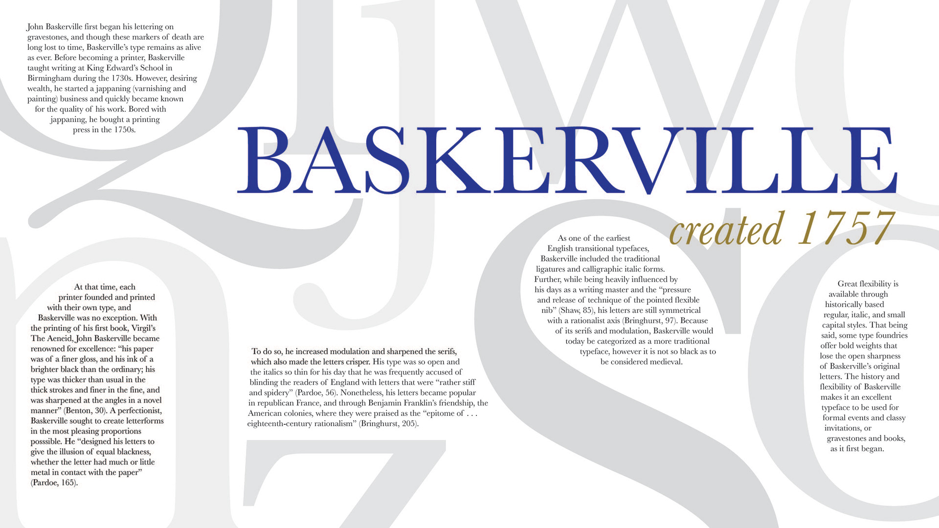
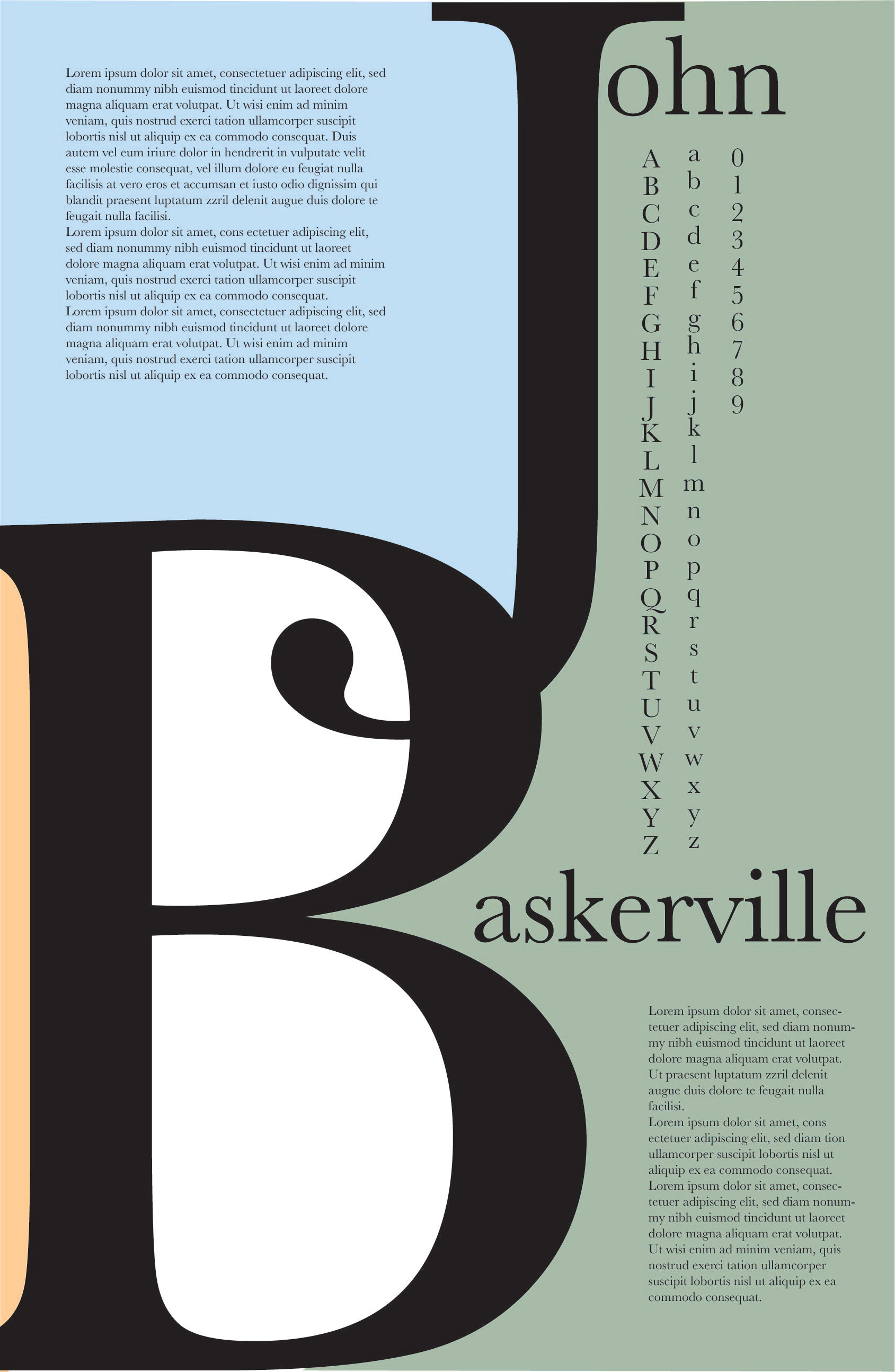
While this initial draft is visually balanced in many ways, I found that it lacked hierarchy and depth. To counteract this I varied the values of the larger letters, increased the title and changed the color scheme from orange to blue and gold. At this point I also had the finalized text to incorporate.
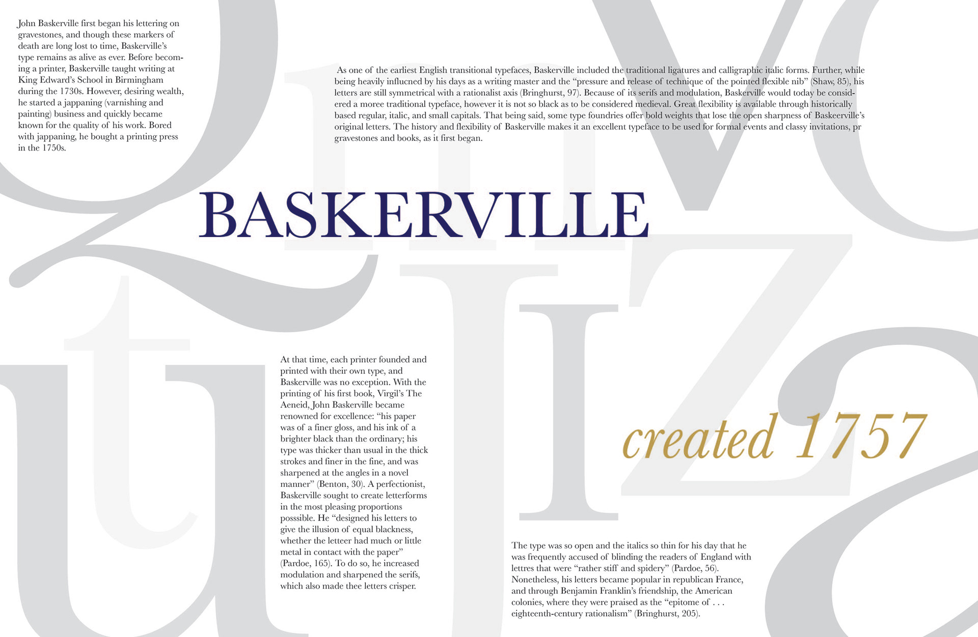
Final Solution
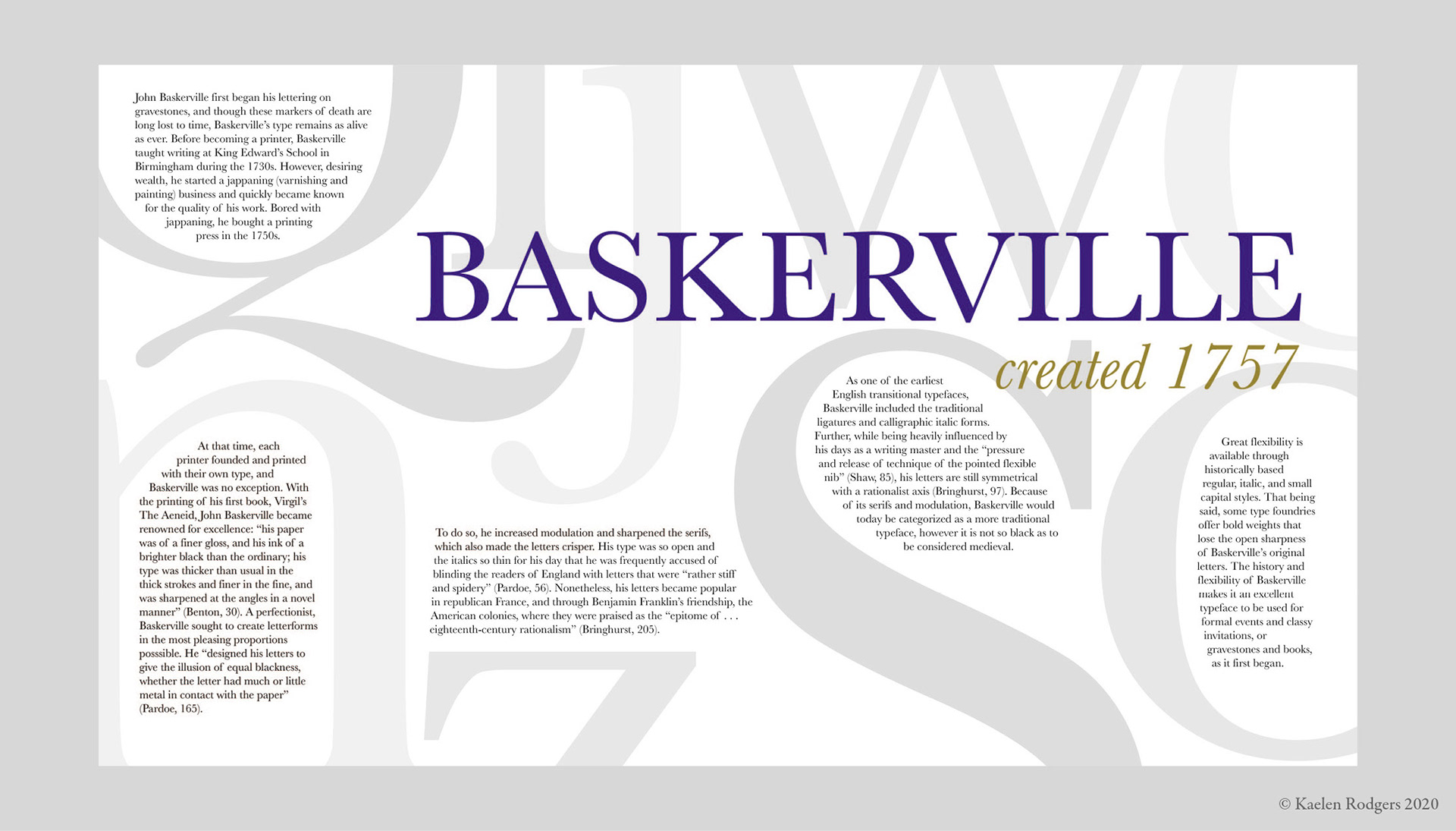
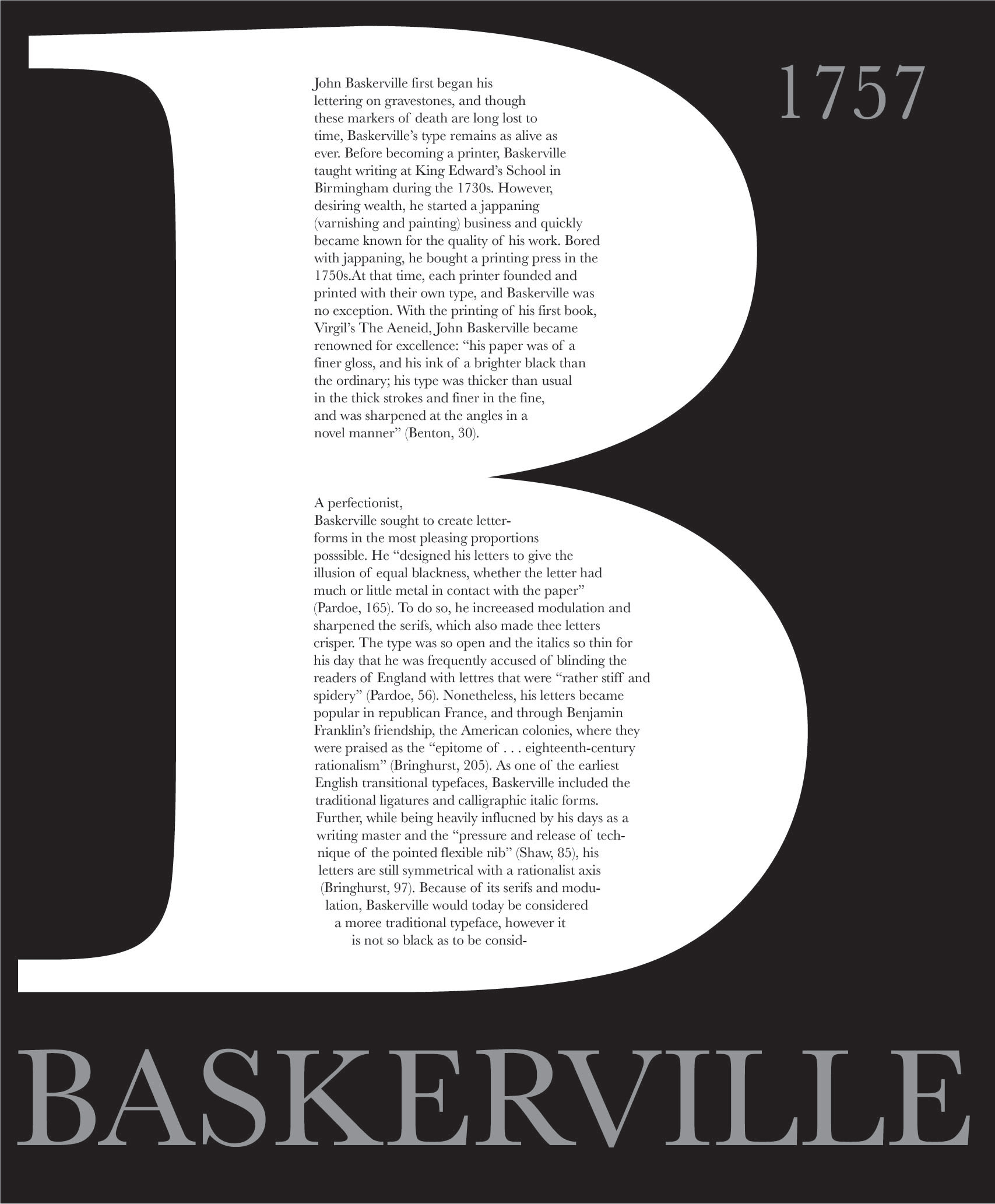
The final text was longer than anticipated, which required rearranging the background letters both to create space as well as to counteract the busyness of the poster. I specifically liked the leading line that the stem of the "Q" created, so I used that as an anchor for rearranging the rest of the poster. I also took greater care with the delicacy of the text wraps and adjusted the blue and gold for better readability, resulting in a poster that not only celebrates typographic history but also serves as a testament to Baskerville's attention to detail.