Objective:
Develop a complete brand identity for Indy Pop, a handcrafted soda company based in Indianapolis, with a focus on natural ingredients, local pride, and effervescent energy. The brand needed to feel fresh and fun while maintaining a clean, modern appeal that communicates authenticity and quality.
Deliverables:
• Visual identity system including logo, color palette, and typography
• Packaging design for bottles and multi-packs
• Promotional materials including print and digital advertising
• Packaging design for bottles and multi-packs
• Promotional materials including print and digital advertising
DESIGN PROCESS:
Inspired by the playful nature of soda and the spirit of Indianapolis, the branding draws from simple shapes, flat color, and a strong bubble motif. Research into local competitors and national beverage trends highlighted a space for a brand that, by focusing on the small business first mindset of many young professionals, could merge vibrant energy with transparency and trust. This balance became the foundation for a visual language that celebrates both fun and flavor.
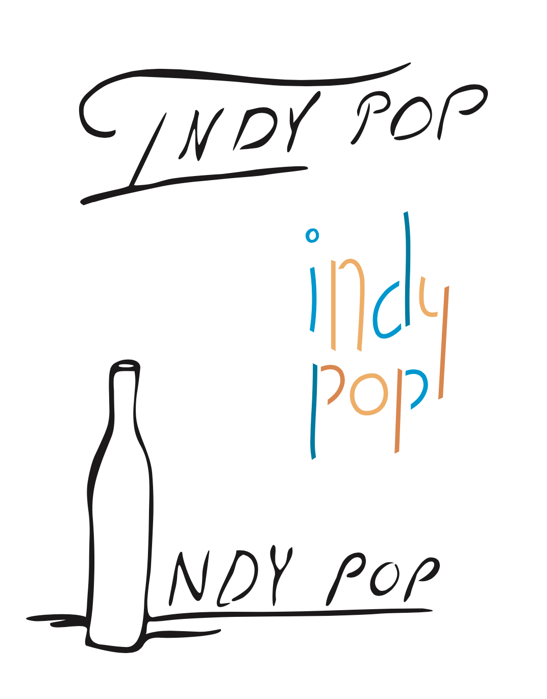
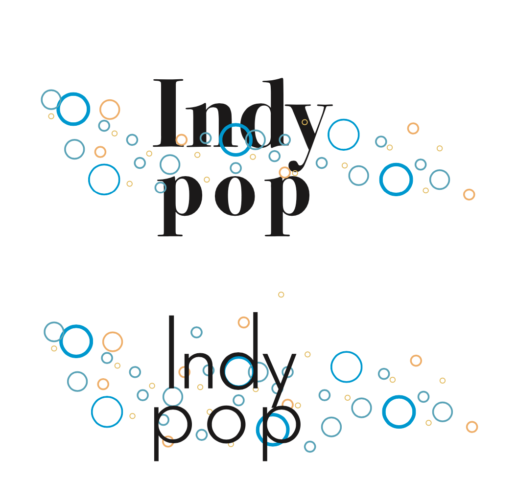
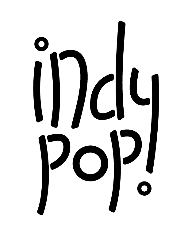
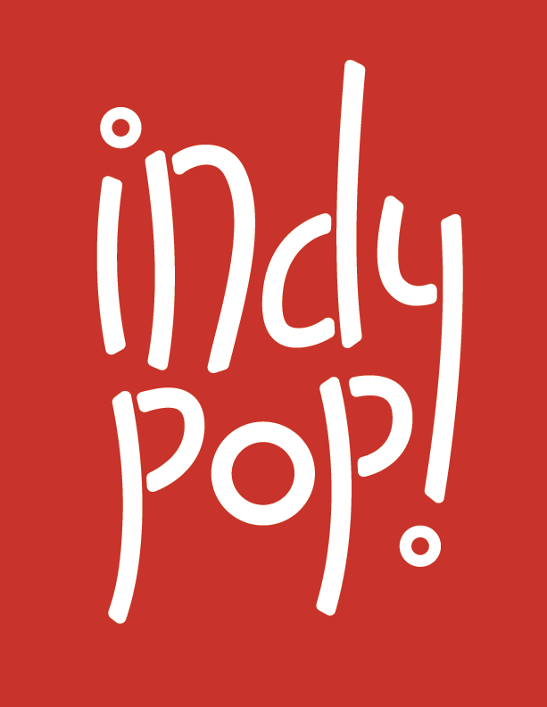
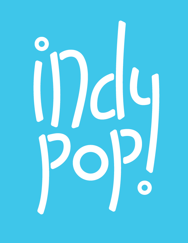
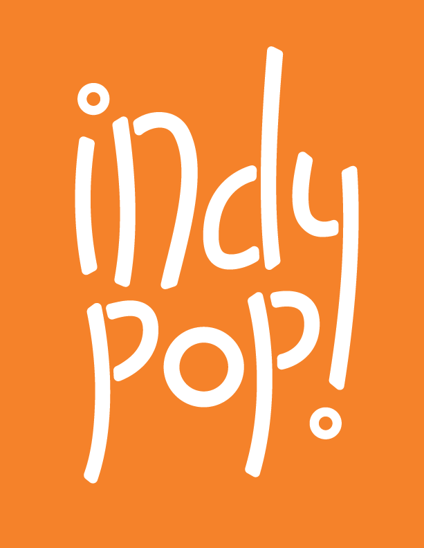
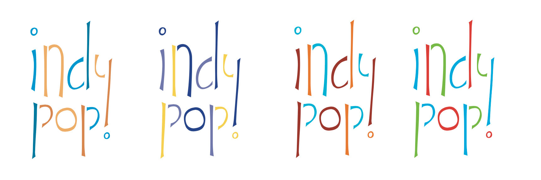
LOGO:
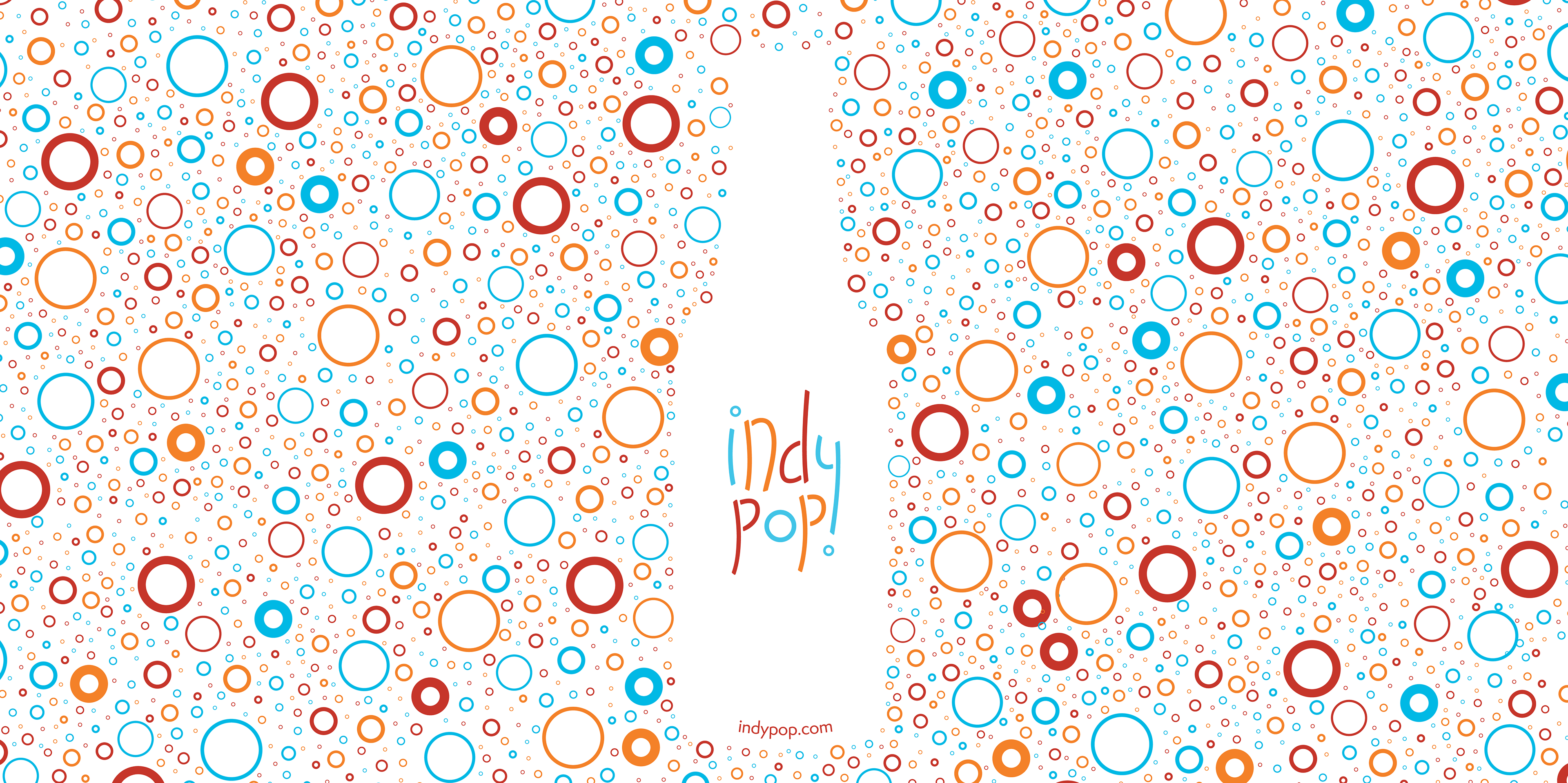
To reflect the all-natural promise and handcrafted quality of the product, I chose a bright, cheerful palette—orange, red, and blue—that feels both lively and approachable. Rounded forms echo the fizz of soda bubbles and help communicate a tone of playful simplicity.
The logo went through multiple explorations before landing on a clean, sans-serif wordmark with subtle modifications: the dot of the “i” and the curve beneath the “y” double as bubbles, reinforcing the brand motif. This detail became the visual anchor for the system, serving as a touch points across different media from packaging to advertising.
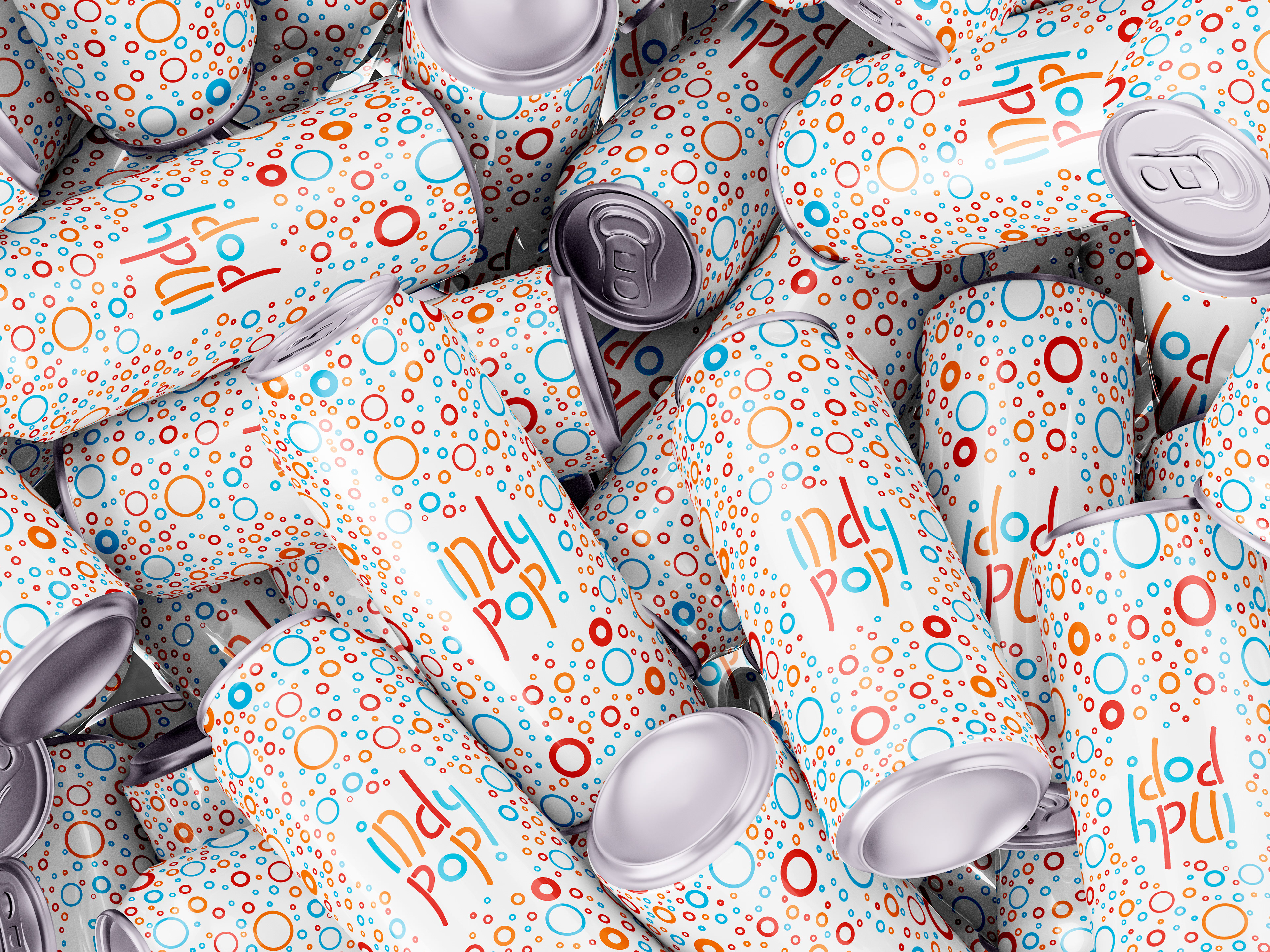
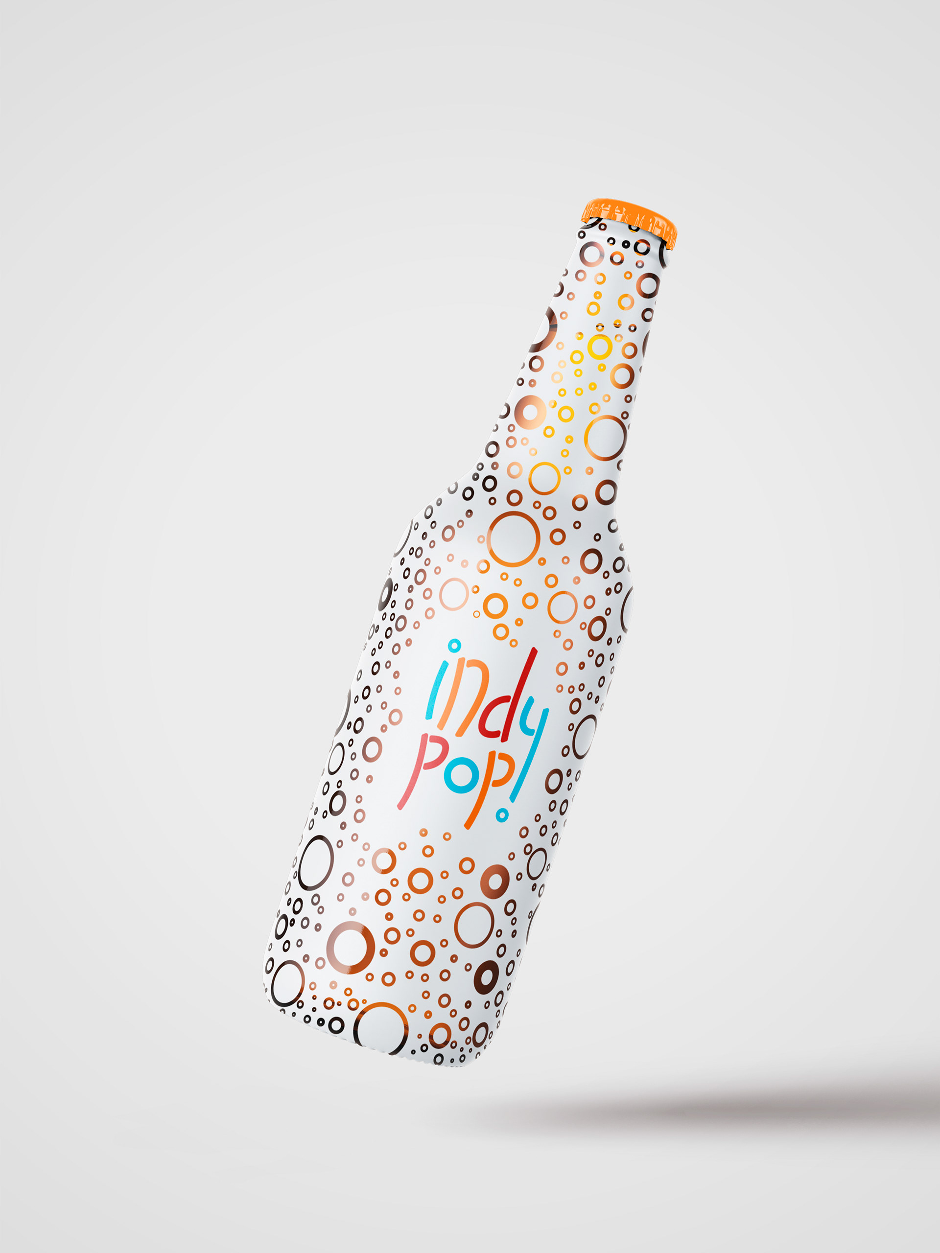
Packaging:
Packaging was designed to amplify the product’s freshness and make a bold impression on shelves. Glass bottles were chosen for their timeless, sustainable appeal, with a painted white base to provide contrast for colorful graphics. In the final iteration, the bottle is fully covered in bubbles, creating a dynamic “overflow” effect that reinforces the bright, playful tone of the brand. These bubbles also provide the secondary purpose of letting the consumers see the soda within the bottle, better reflecting the all natural commitment of the company.
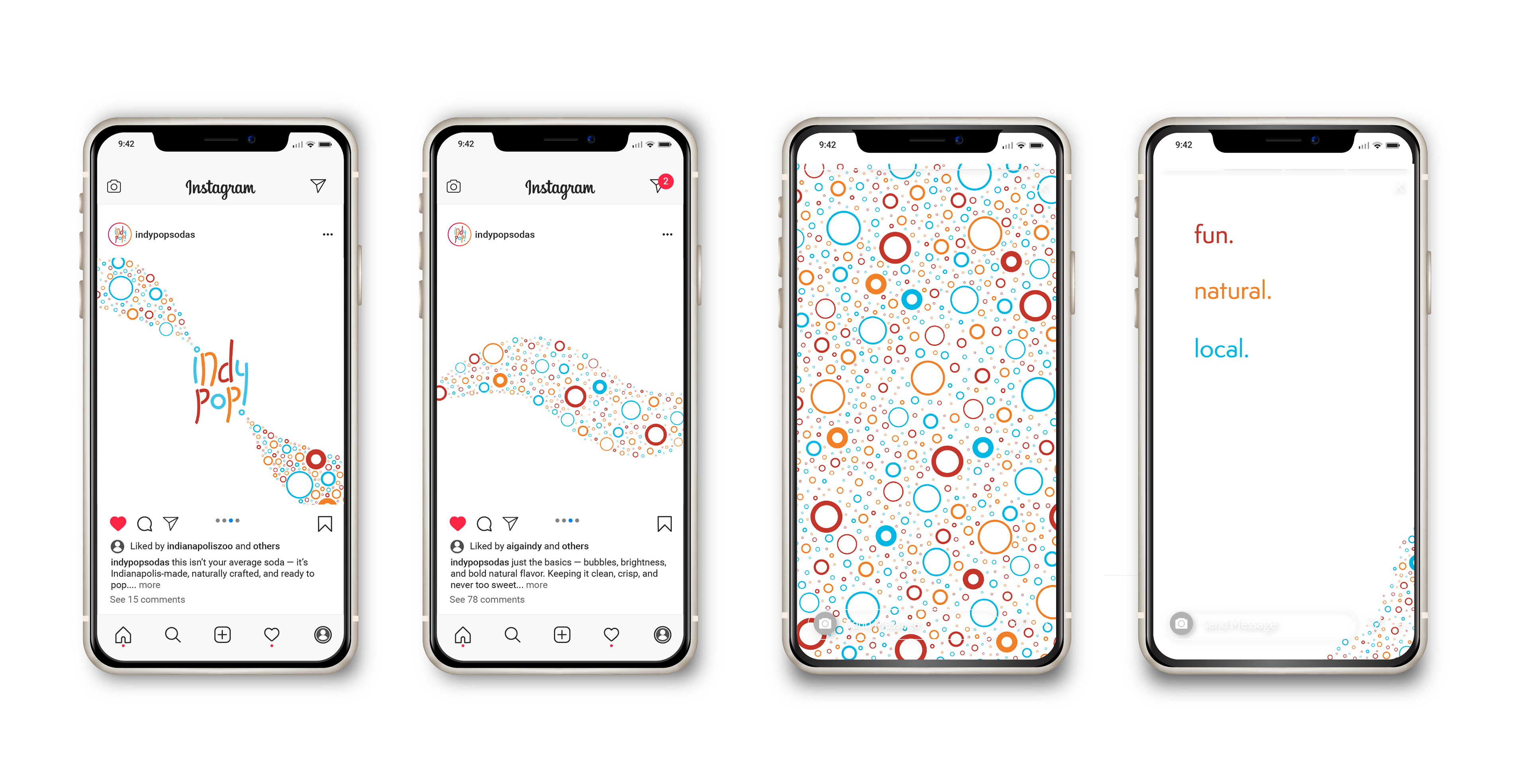
Advertising:
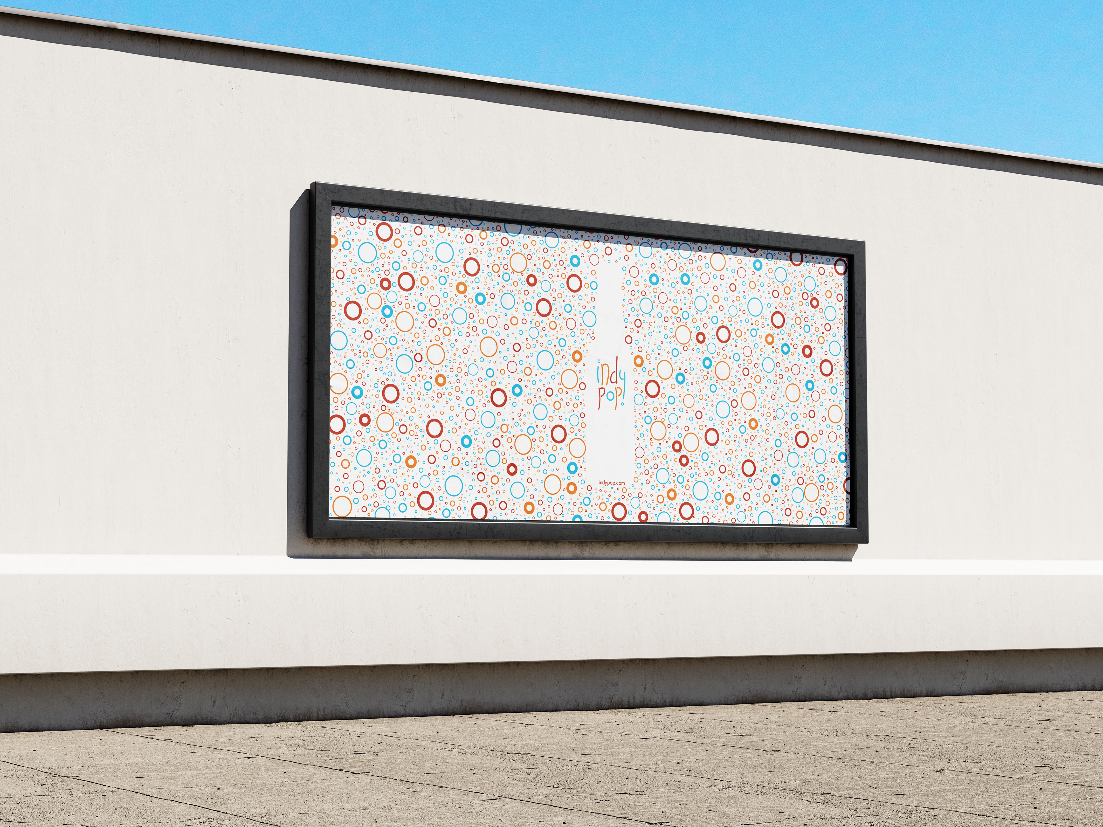
The advertising system extends the bubble motif of the logo and packaging into a flexible, eye-catching visual language that balances consistency with creative variation. Each ad uses the brand’s signature outlined bubbles in different densities, sizes, and arrangements to evoke the fizzy, refreshing experience of opening a soda—while always staying rooted in the simplicity and brightness that defines Indy Pop's drinks.
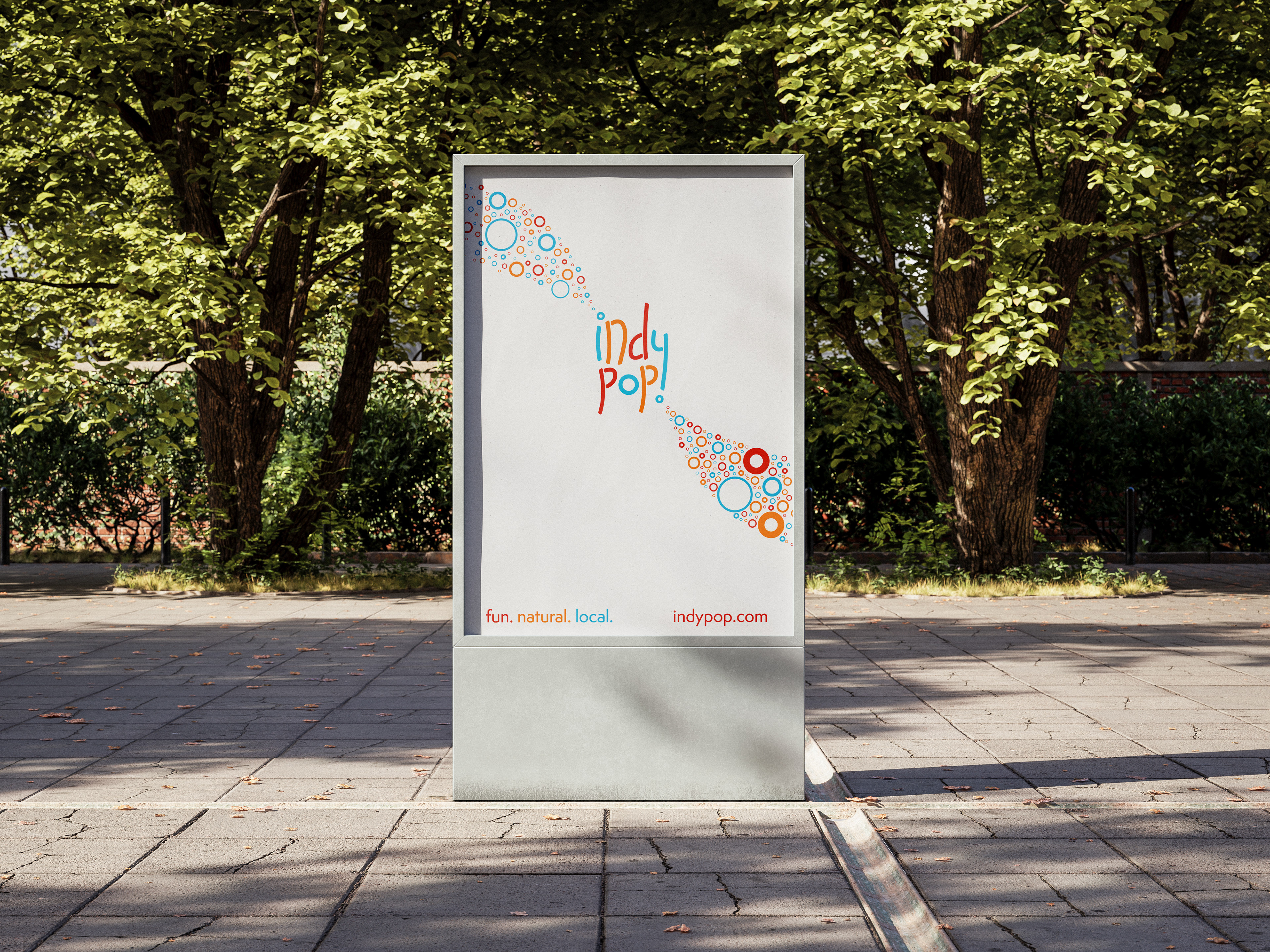
One approach uses trails of bubbles across a white background, creating a clean, spacious composition that leads the viewer’s eye toward the logo or product. This open layout sparks curiosity and reflects the brand’s all-natural simplicity, drawing attention without overwhelming.
The second approach is more vibrant and immersive: the full frame is filled with bubbles, forming an energetic backdrop that sometimes reveals the soda bottle shape through negative space. This direction leans into the playful, celebratory side of the brand, making a bold impression while keeping the imagery fresh and fun.
Both styles are designed to speak to a young adult audience—visually engaging, easy to recognize, and always bubbling with personality.
FINAL IDENTITY:
Indy Pop stands out with a bold yet refined brand that captures the joy of handcrafted soda. The cohesive system—rooted in color, form, and clarity—translates across packaging, print, and digital with consistency and charm. Through vibrant visuals and clever detailing, the brand celebrates natural ingredients, local roots, and the simple fun of a great soda.