SIMPLE OVEN
OBJECTIVE:
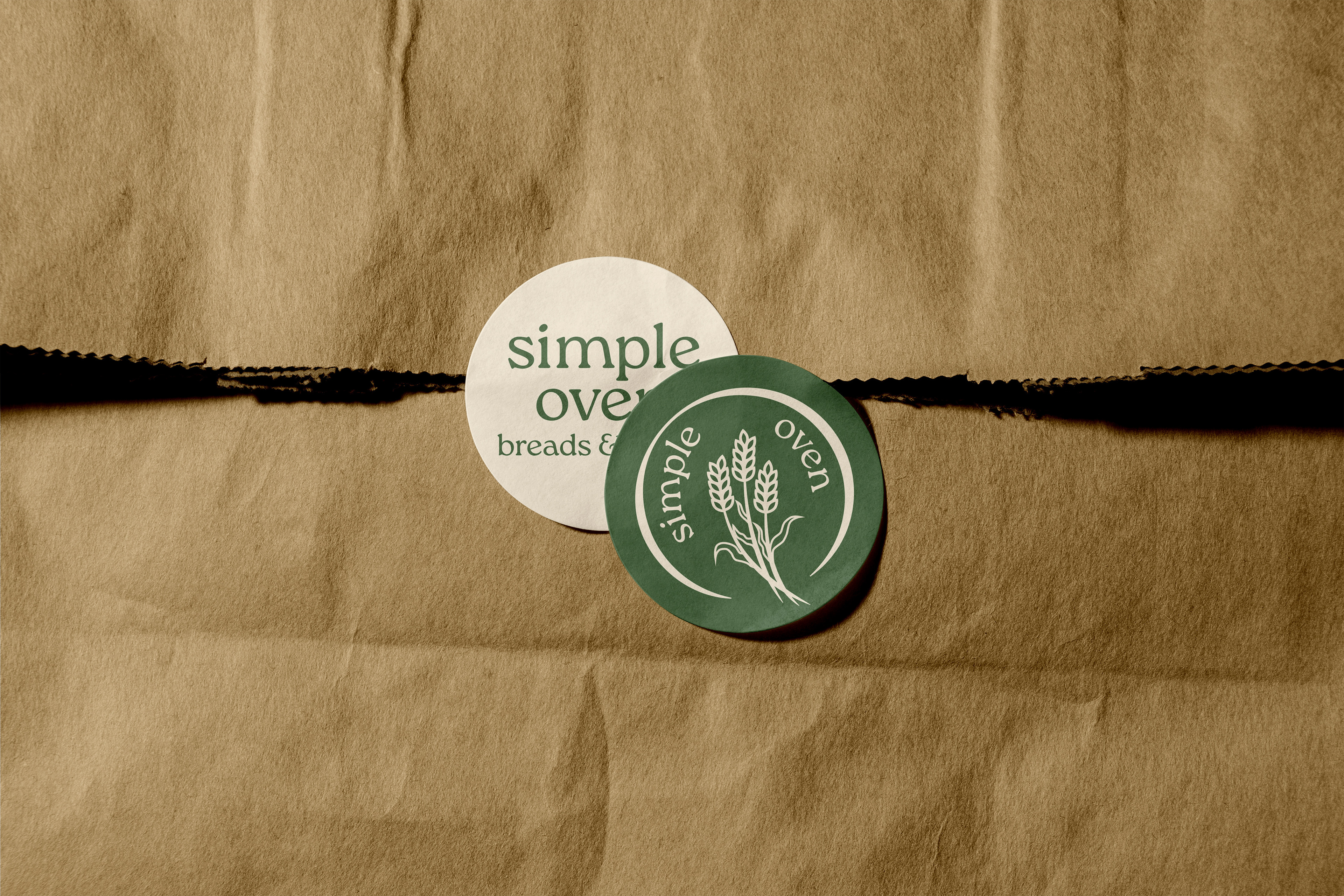
Create a branding system for Simple Oven Breads & Bakes, a home bakery rooted in delicious foods made with only organic flours. The visual identity needed to feel rooted in the local community and familiar to the farmers’ market and fair audience while remaining distinct from cluttered or over-engineered branding often found among home businesses.
DELIVERABLES:
• Easy to follow brand identity system, including logo, color palette, and typography.
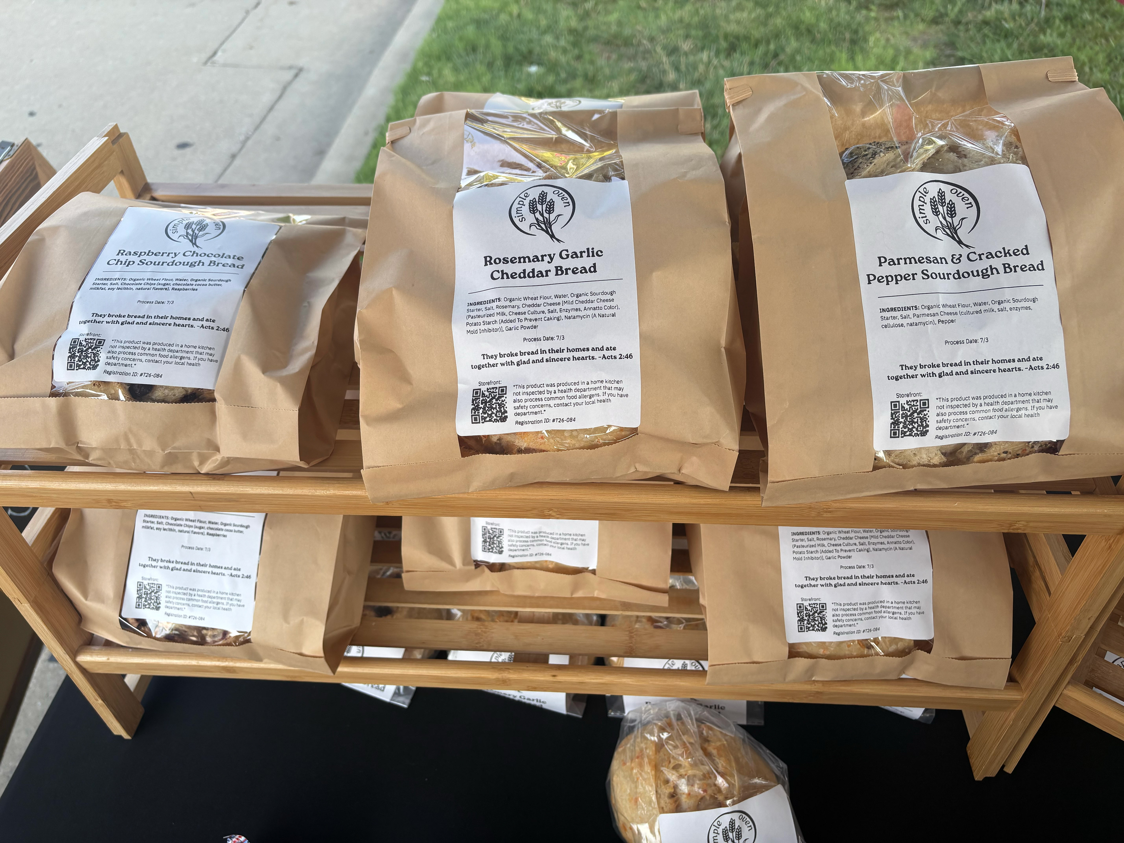
• Packaging labels for current products and a flexible template for future expansion.
• Ideation and vision casting for online engagement and outreach.
DESIGN PROCESS:
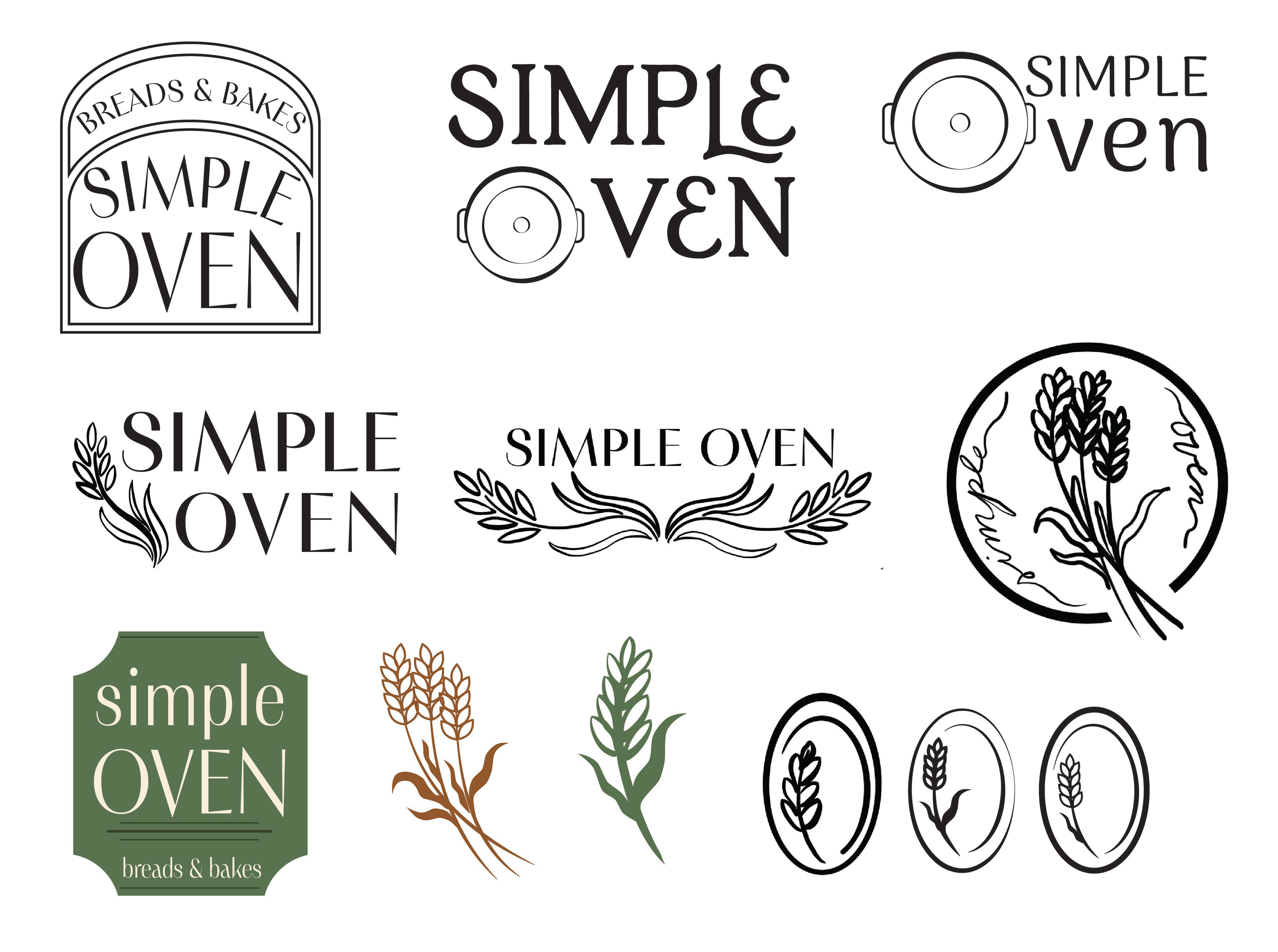
A major goal of this project was to create something that felt at home within the local bakery landscape without getting lost in it. Much of the research focused on how other home bakeries present themselves, looking for opportunities to create something that felt familiar and community-oriented while still having a clear point of view.
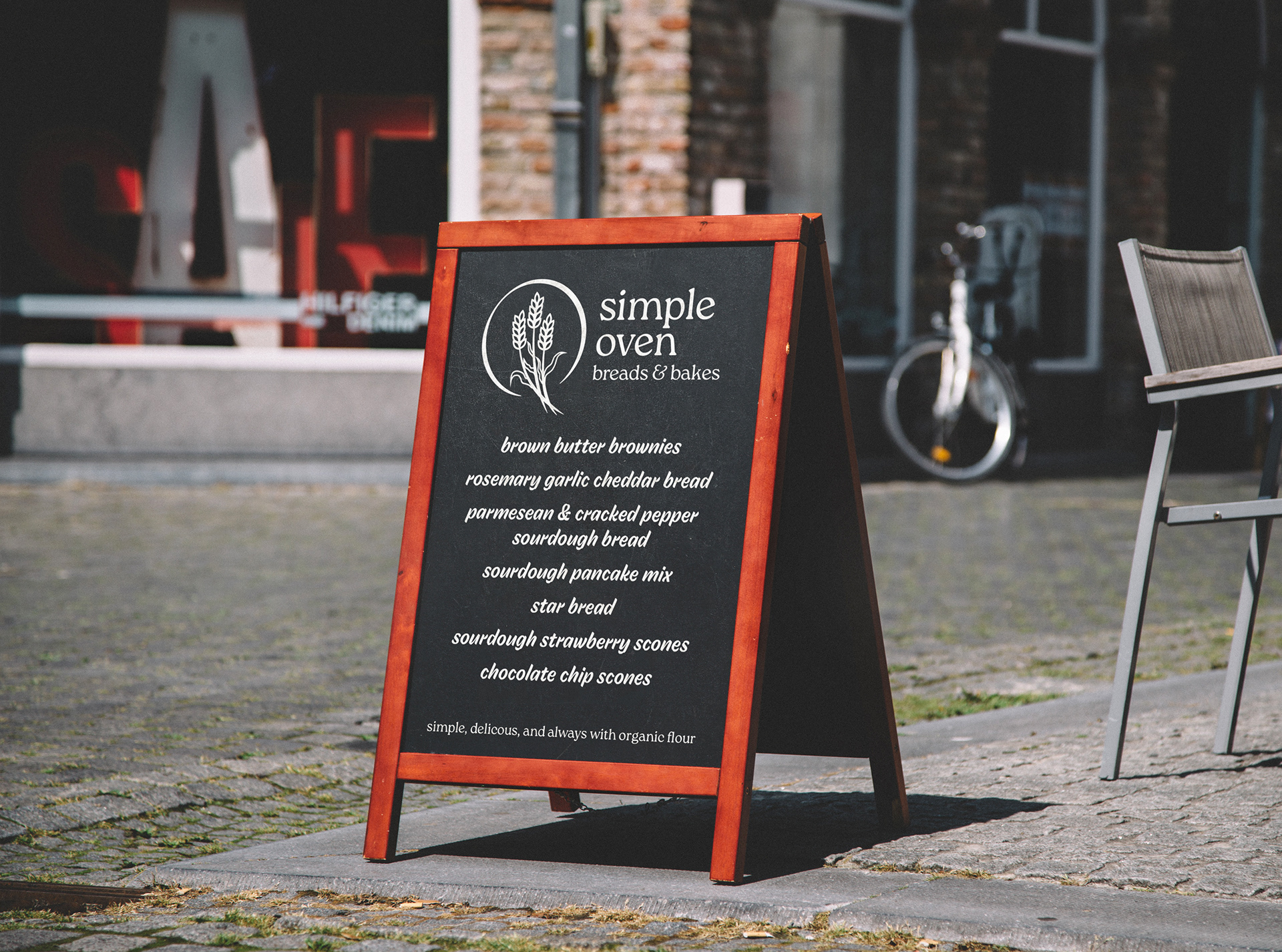
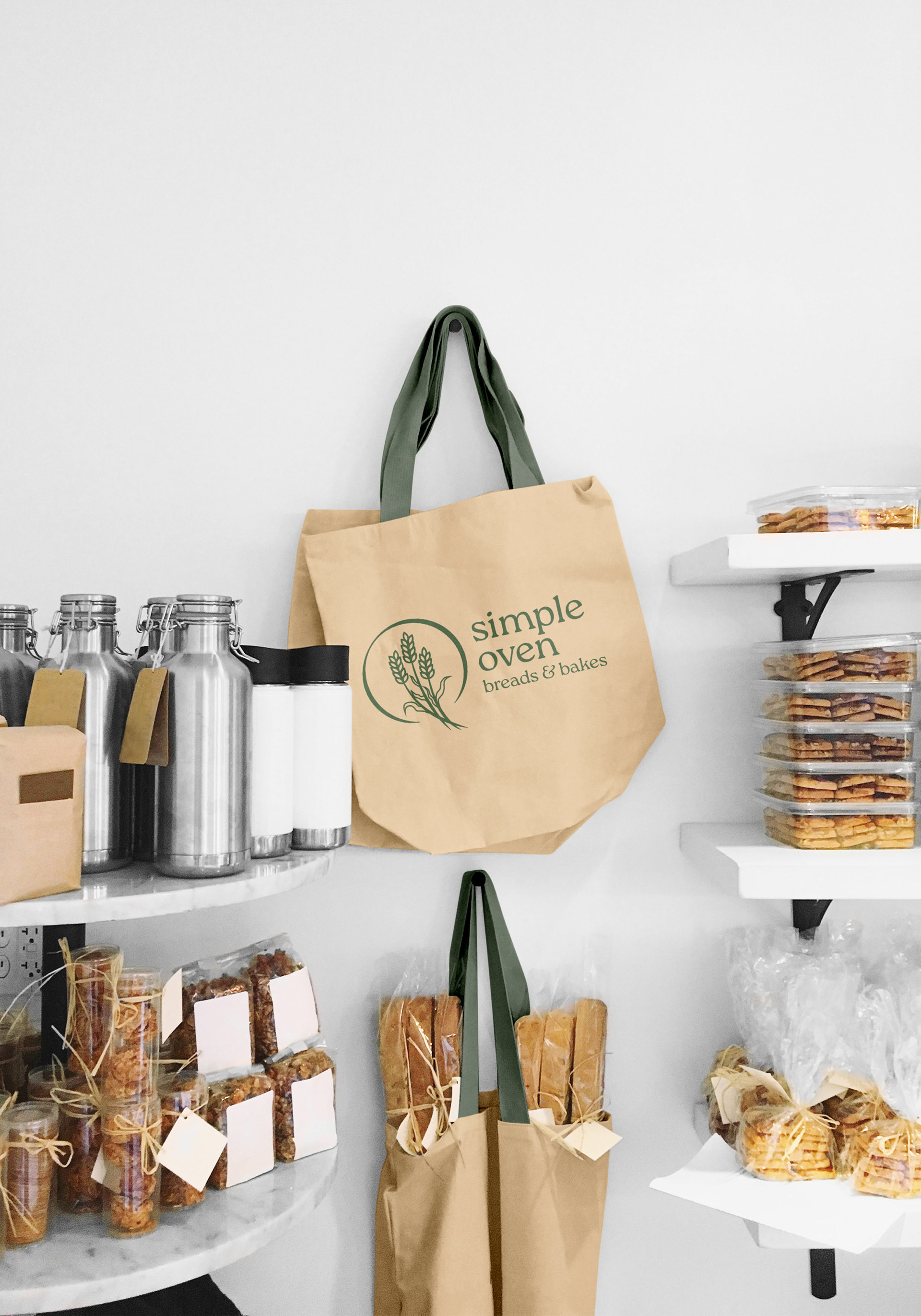
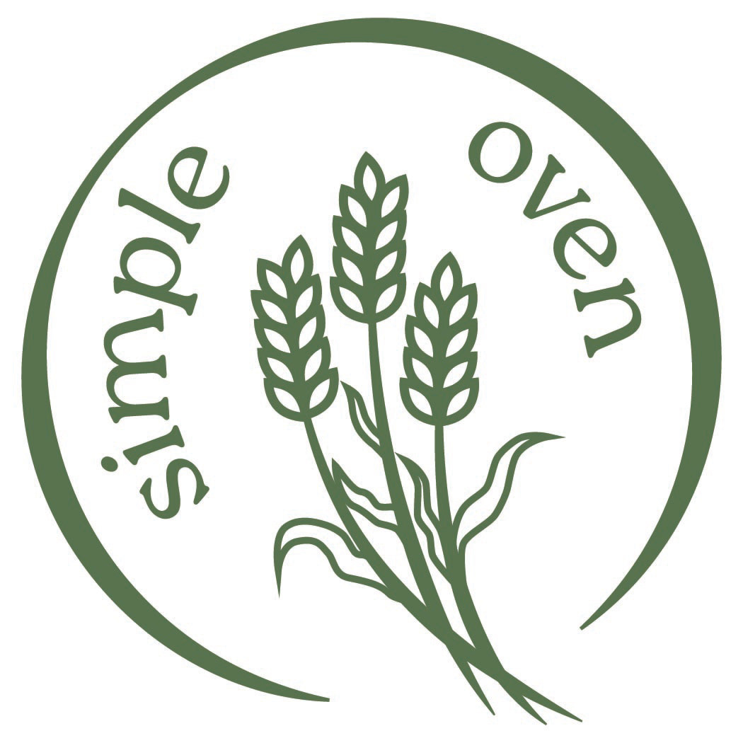
After exploring ideas that range from a piece of bread to a dutch oven, I repeatedly came back to the image of wheat as it immediately communicates the both the product as a whole and its connection to natural ingredients and traditional baking. In the end, the logo takes a deliberately simple approach. The result is open, friendly, and recognizable—a logo that feels like it belongs at the farmers’ market without trying too hard to prove that it does.
The same philosophy guided my color and type choices. Dark sage and cream with the slightest hint of pink create an organic, natural palette that feels easygoing and inviting without becoming overly precious or trend-driven. The colors have a sense of confidence and belonging: they know where they fit and are comfortable being there.
Roca was chosen as the primary typeface for its warmth, personality, and approachable character. Gaultier provides contrast for body copy, bringing enough character to stand alongside Roca without competing with it or overwhelming the reader.
Because Simple Oven is a small business that will need to manage much of its own design work moving forward, I also recommended accessible alternatives such as Calluna and Inter for use in Canva. This gives the client the tools to continue building the brand independently rather than creating a system that depends on a designer to maintain it.
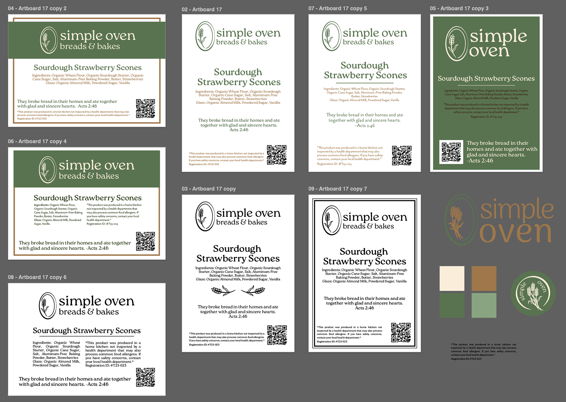
The packaging labels were designed with that same sense of practicality in mind. Rather than creating a system that only works for the products that exist today, the black and white labels provide a straightforward foundation that can grow as the bakery adds new breads and bakes. The goal was to make the brand easy for the client to use, understand, and produce herself.
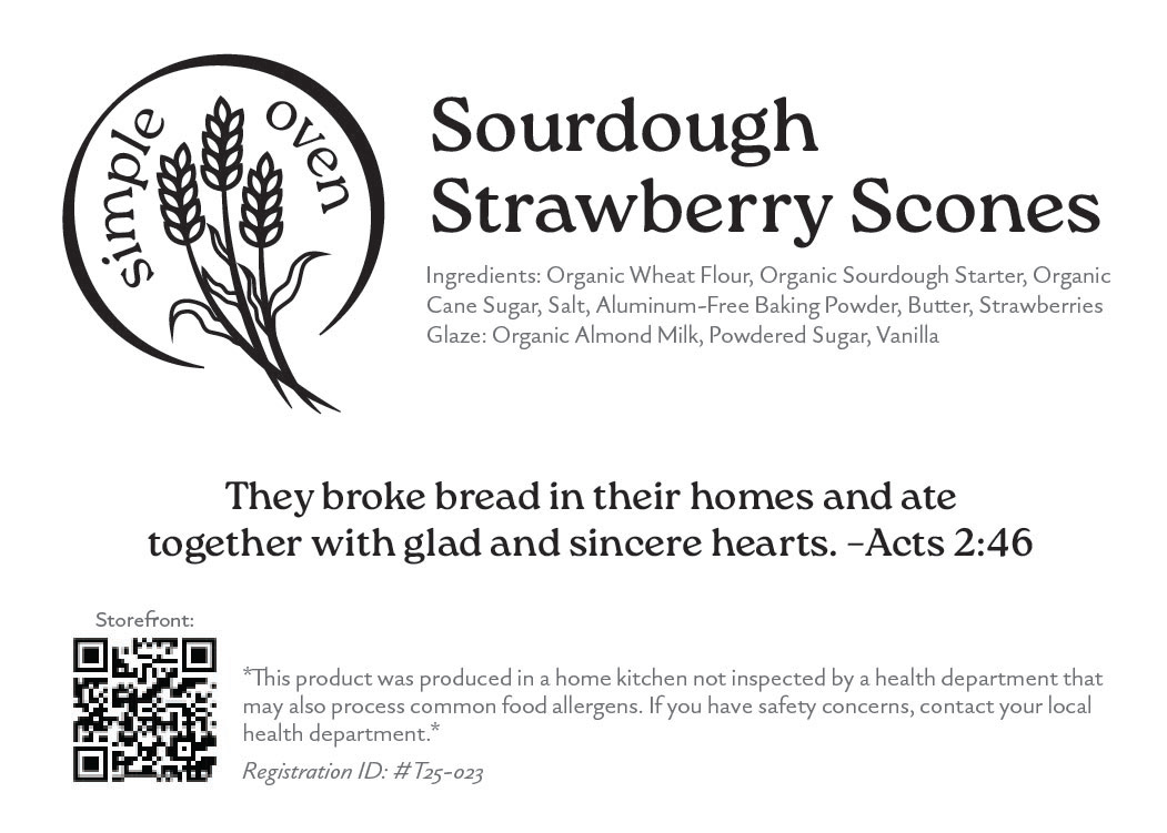
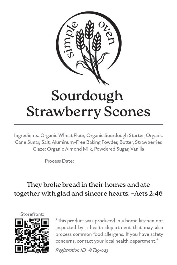
Throughout the project, caring well for the client was just as important as creating a strong visual identity. As a small business, Simple Oven does not have the resources of a large company with an in-house marketing team or a design agency on retainer. The branding needed to do more than look good—it needed to empower its owner to become an active participant in the future of her brand.
The final identity for Simple Oven Breads & Bakes is intentionally simple, warm, and grounded. Every element was chosen to feel natural to the business and its community while giving the brand enough distinction to be remembered.
More importantly, the system was built with the person behind the business in mind: approachable enough to use, practical enough to maintain, and thoughtful enough to grow with her.