OTHER ISLANDS DESIGN MUSEUM
OBJECTIVE:
Create a branding system for Other Islands, a design museum that bridges design, play, and education that reflects the museum’s mission to spark curiosity, encourage design thinking, and promote learning through interactivity.
DELIVERABLES:
• Comprehensive brand identity system, including logo, color palette, and typography.
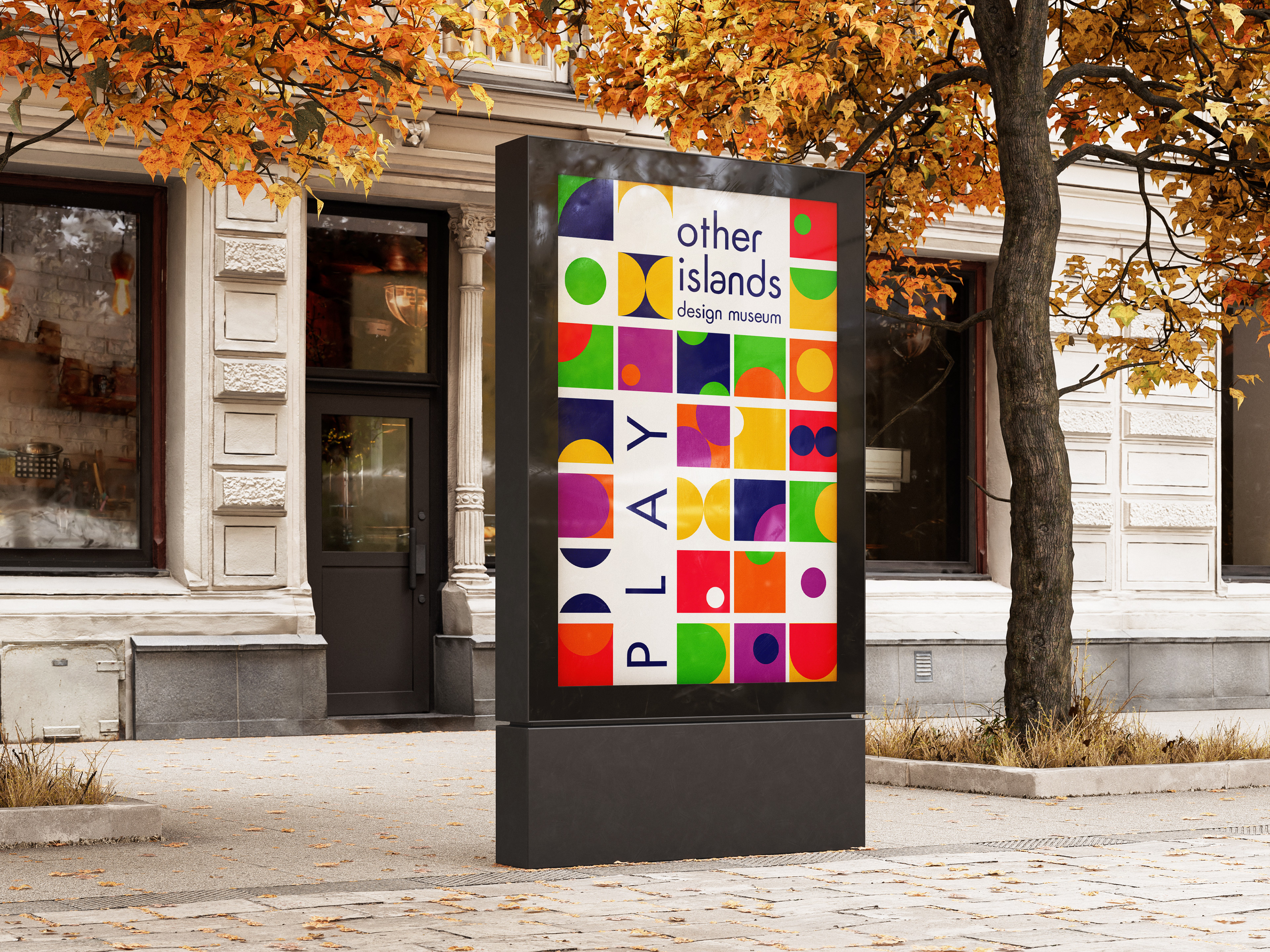
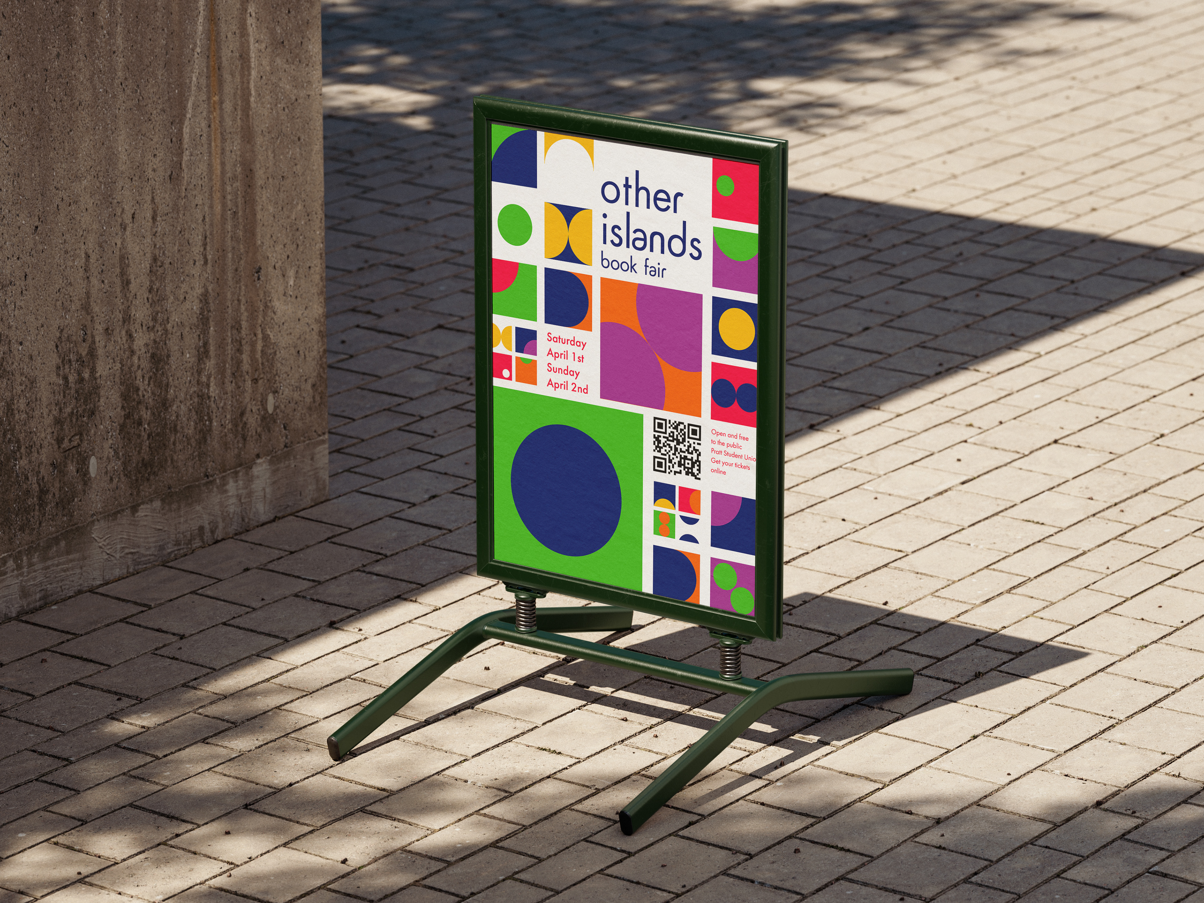
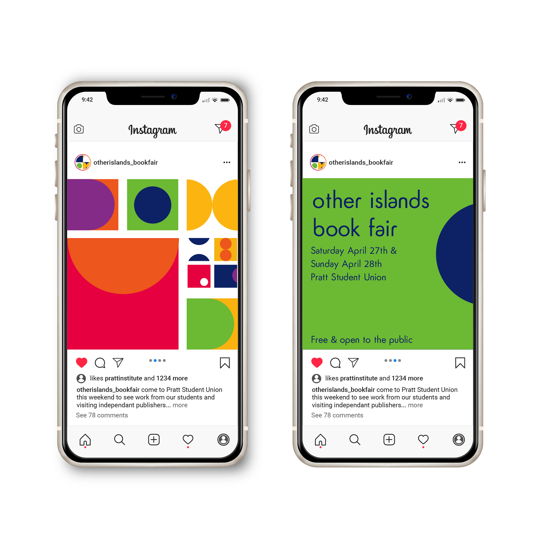
• Visual guidelines to ensure cohesive branding across digital, print, and environmental applications.
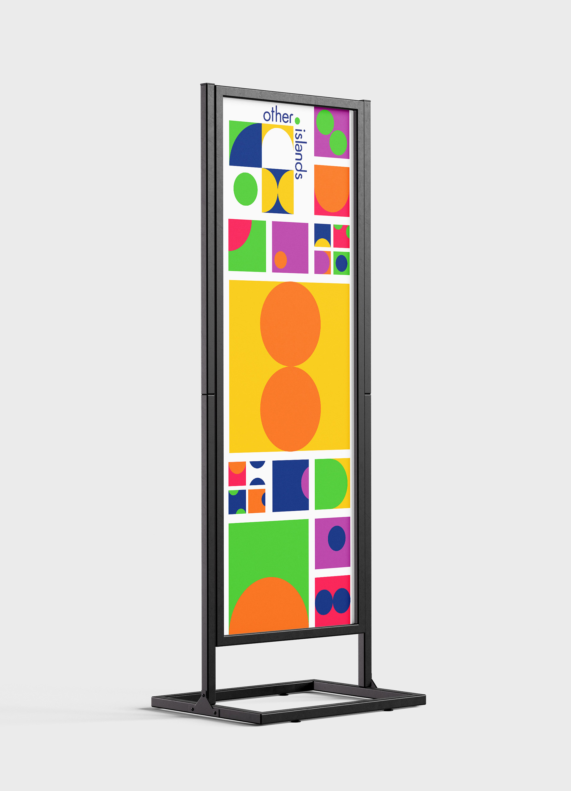
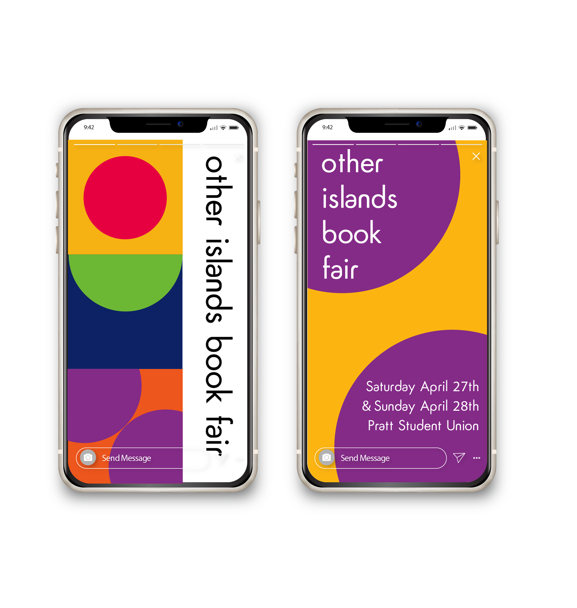
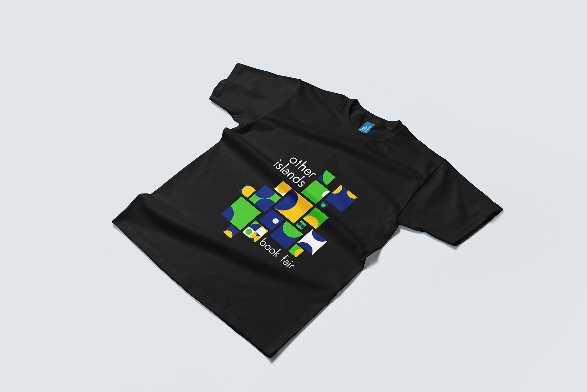
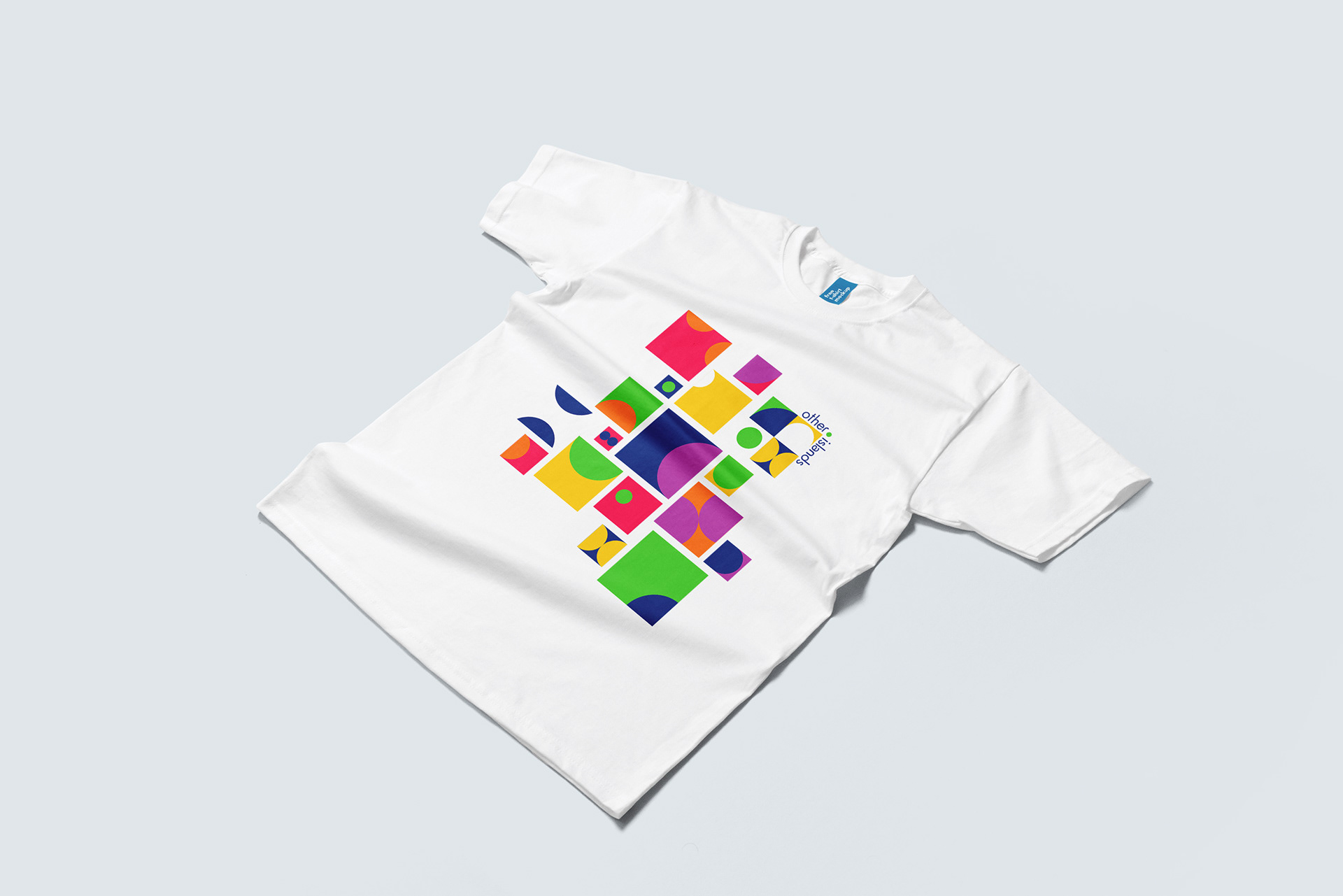
• Concepts for branded collateral such as signage, merchandise, and promotional materials.

DESIGN PROCESS:
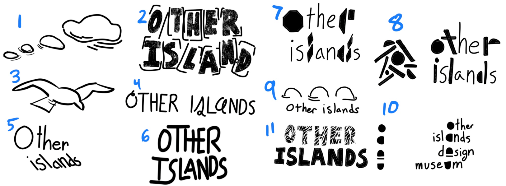
Though I began most of my ideation around the word “island,” I was quickly drawn back to the earliest days of my design education- shapes, colors, and iteration.
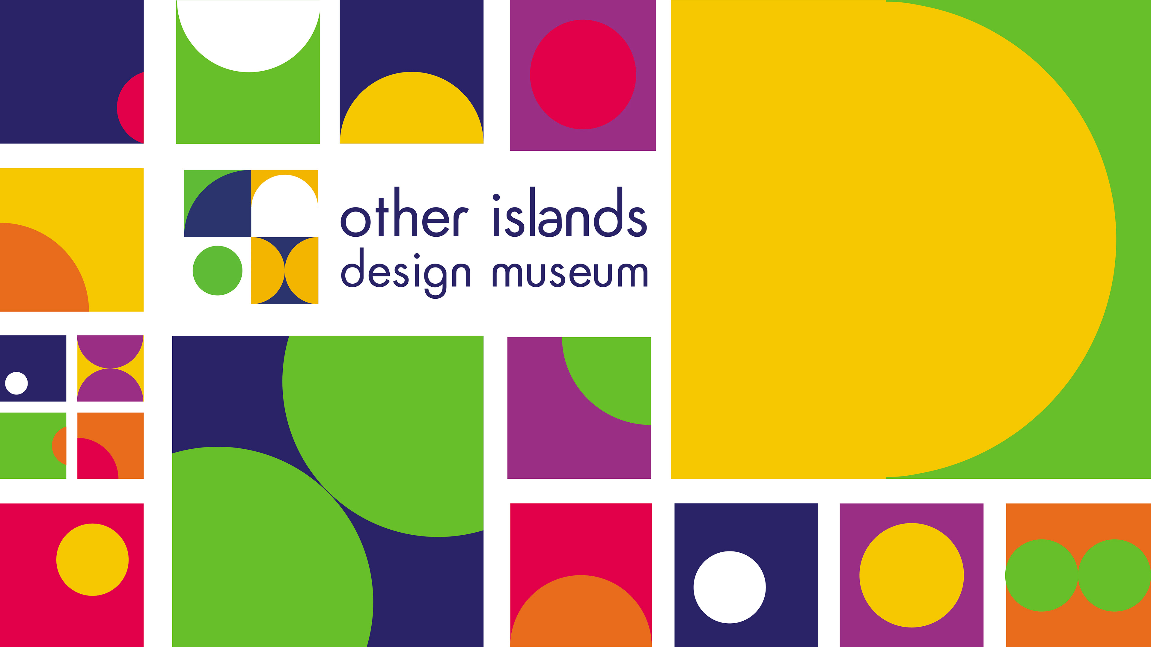
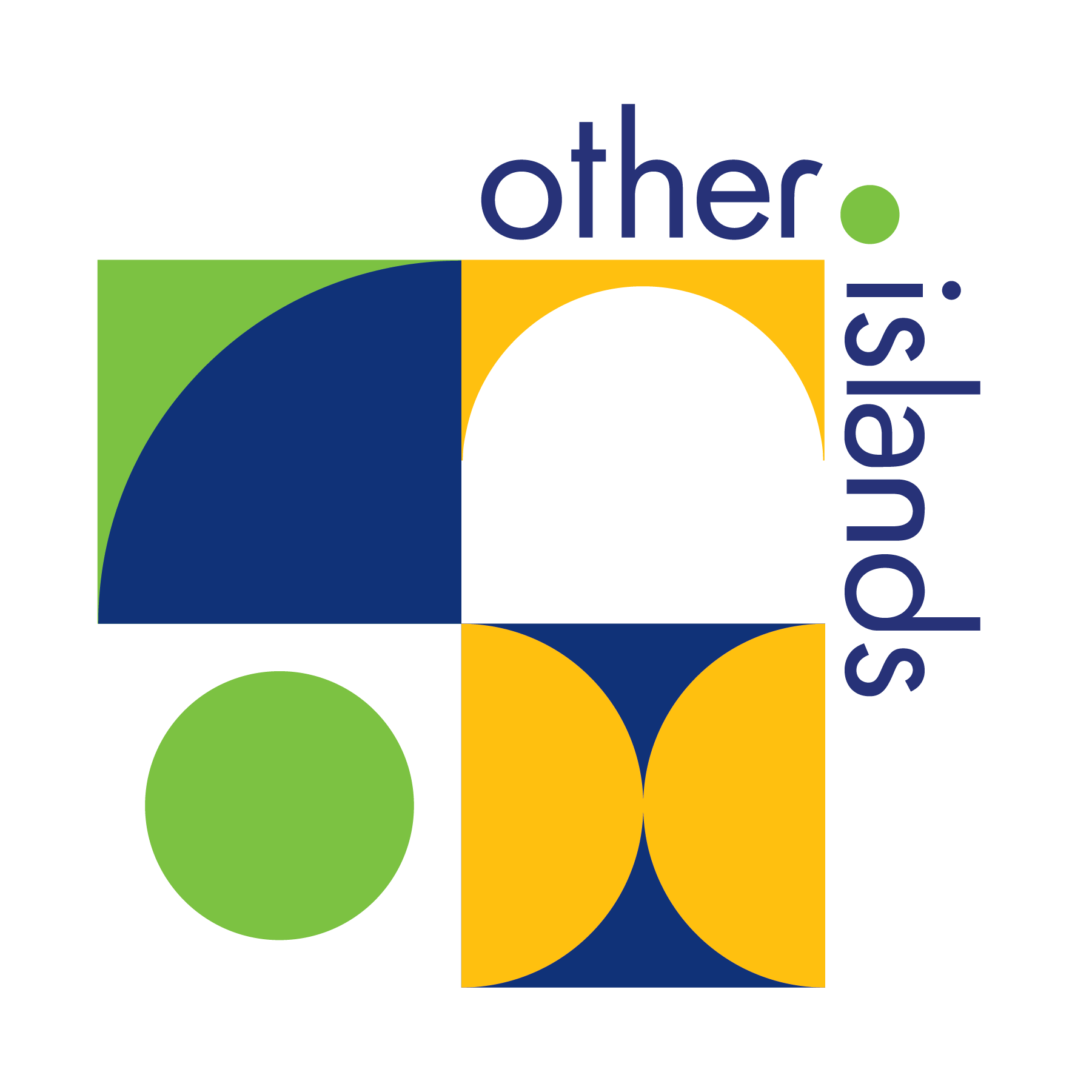
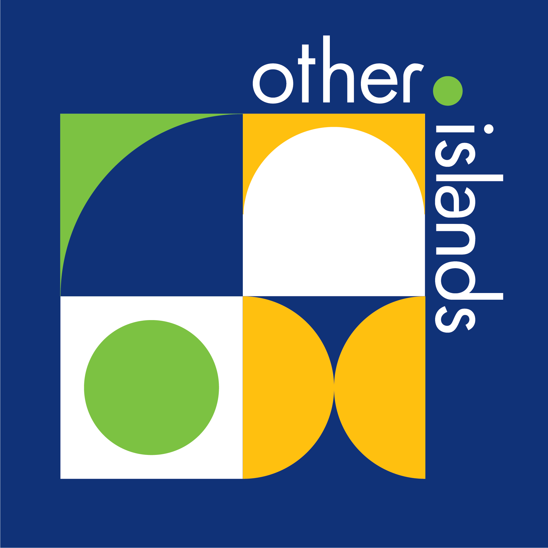
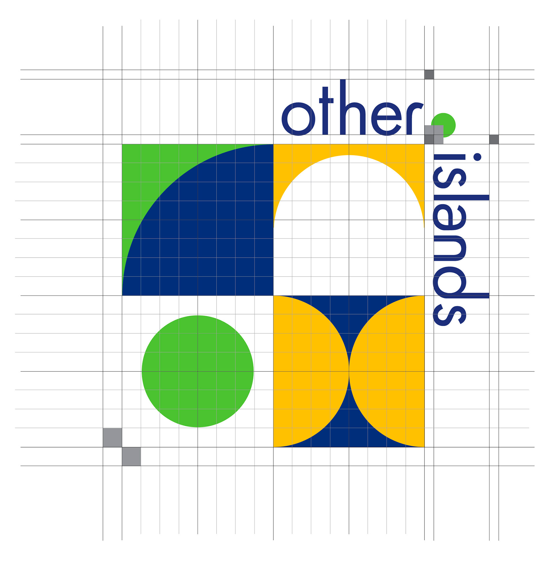
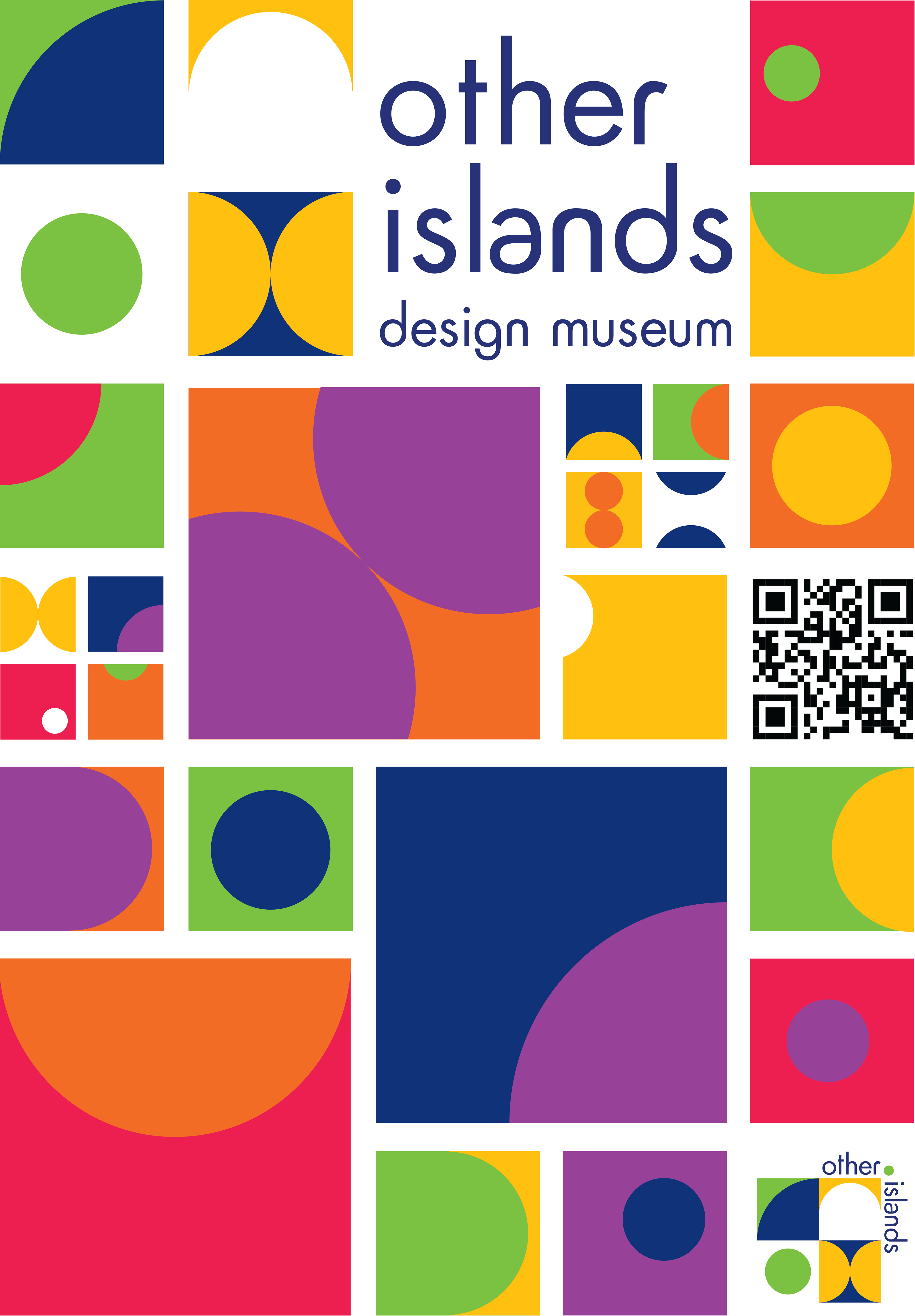
As I continued playing with those elements, I chose a variety of unique yet related pattern swatches to symbolize community and connection, reflecting how design and creativity bring people together. The geometric shapes are arranged on a structured grid to represent how simple components combine into a greater whole, highlighting the collaborative spirit of the museum.
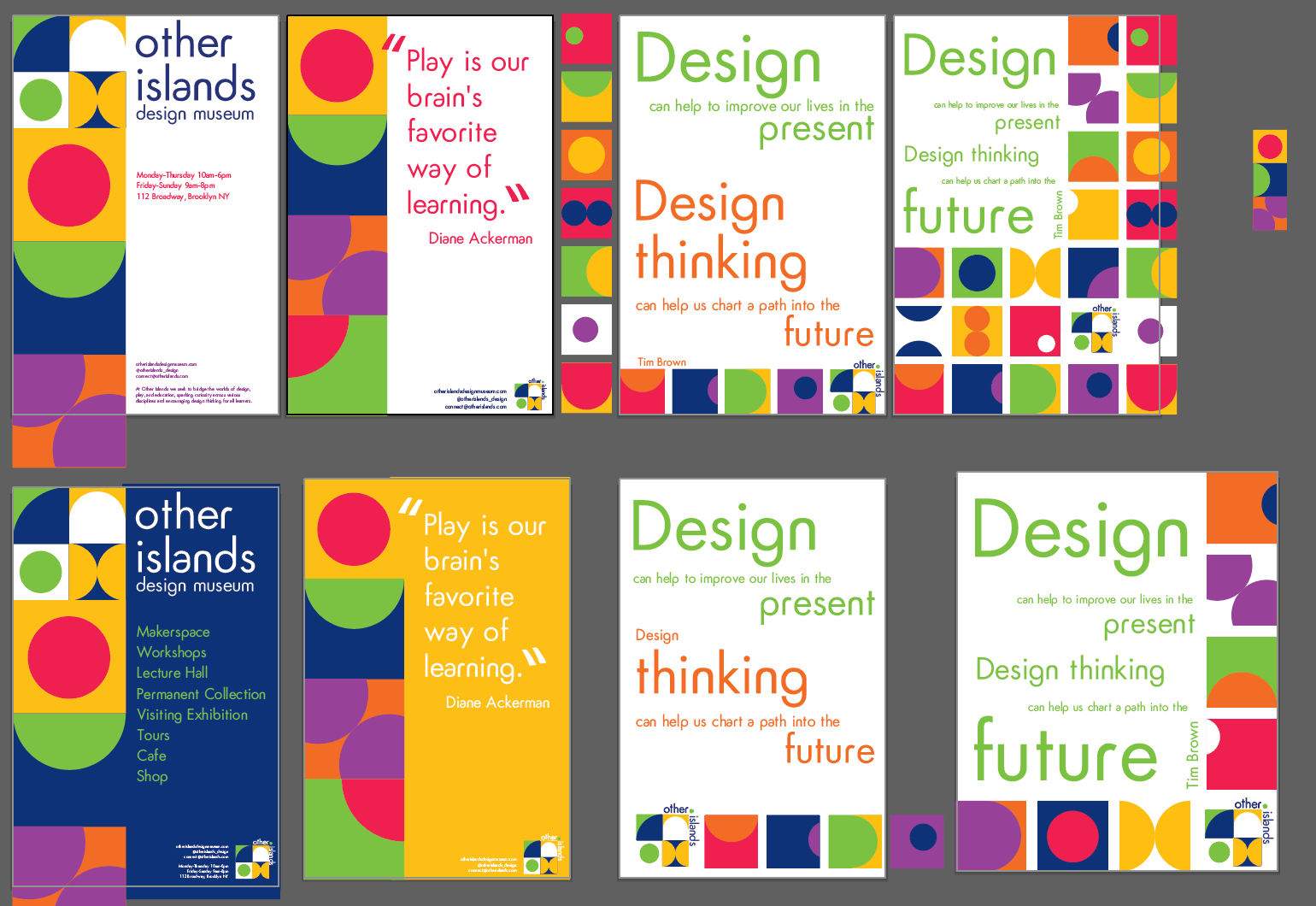
The modular logo system was developed to be adaptable across print and digital media, with each block functioning independently while remaining crucial to the brand’s visual story.
I chose the bold, vibrant color palette to evoke playfulness and creativity, aligning with the museum’s mission to encourage learning through exploration.

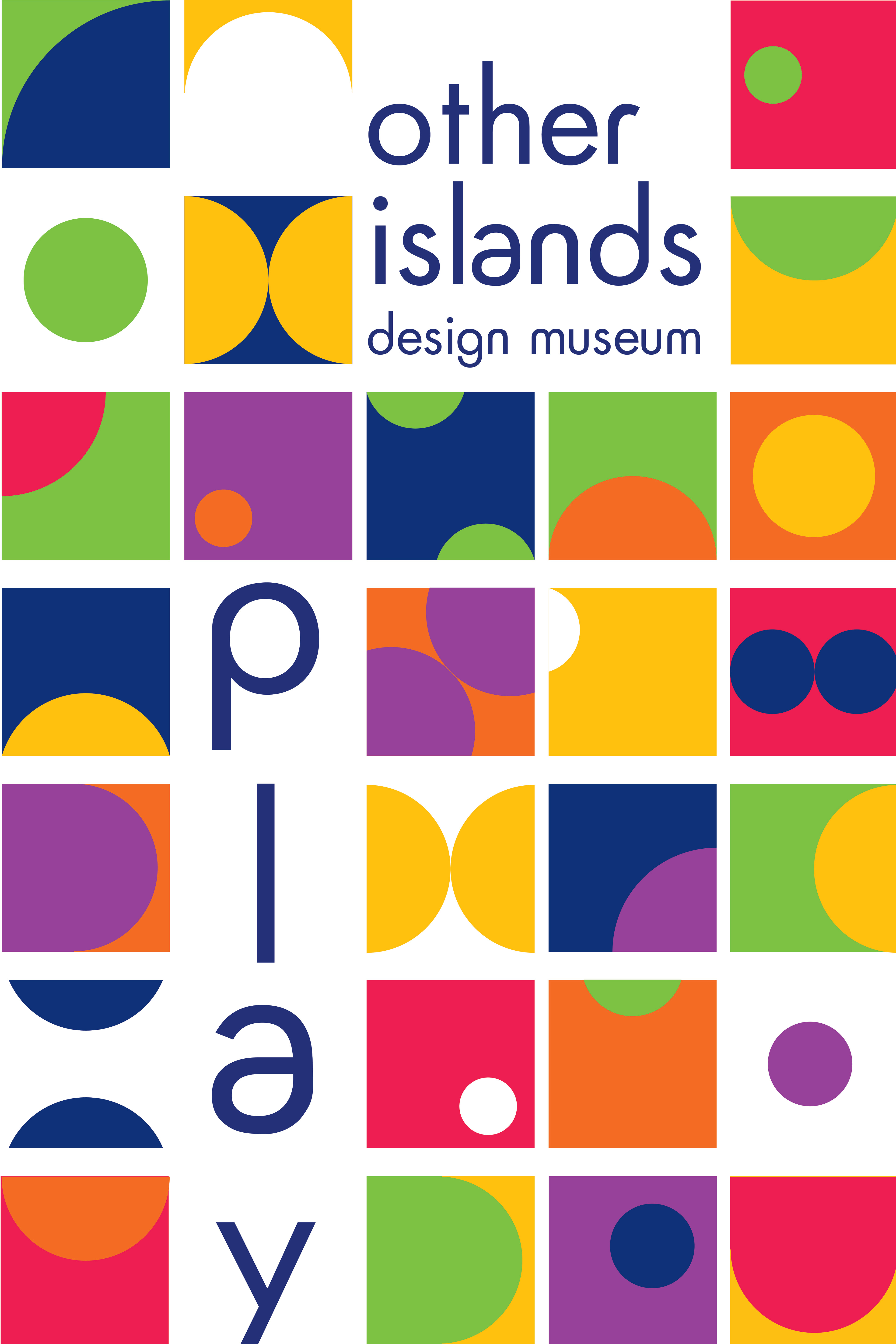
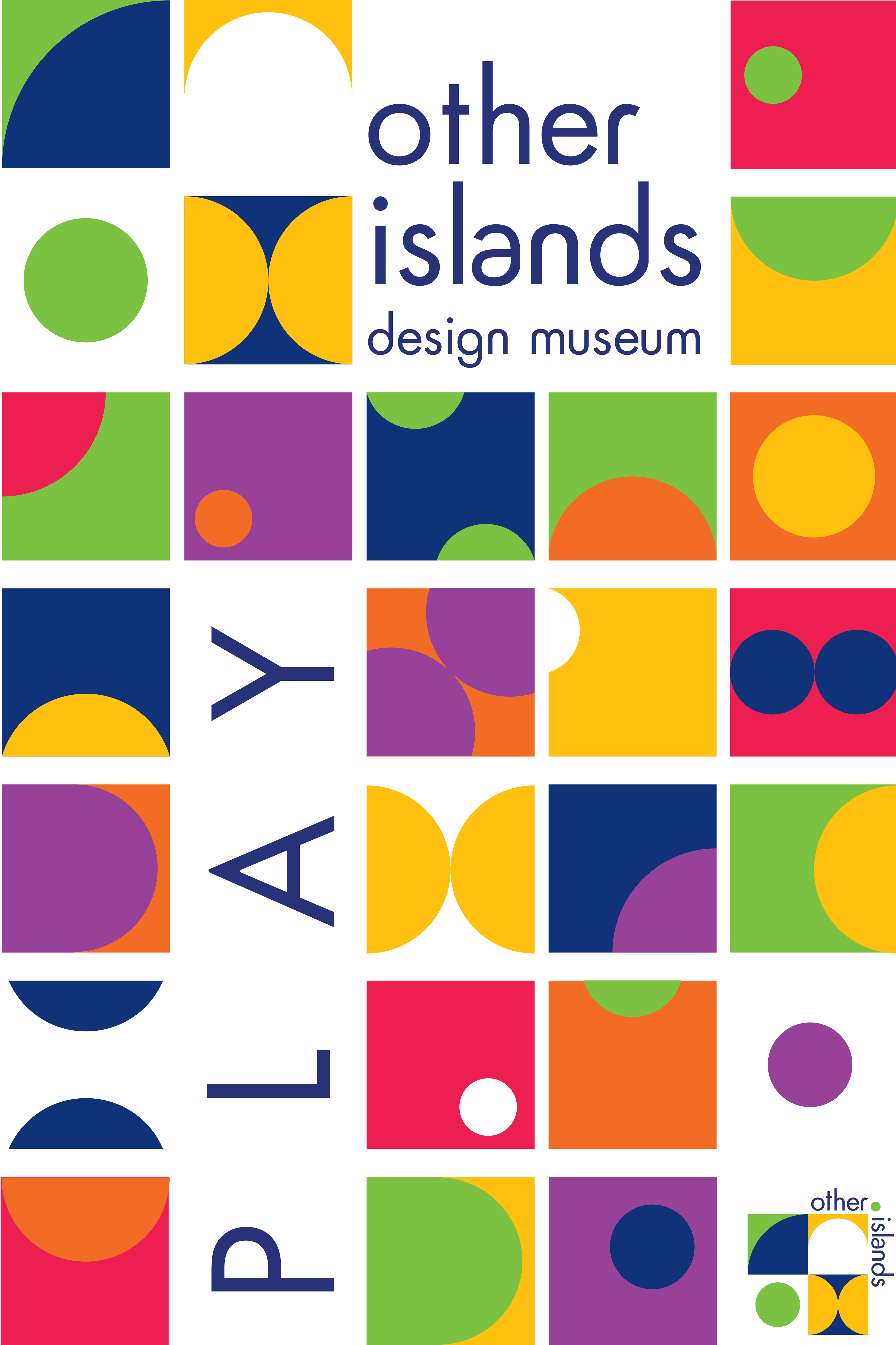
For the typography, I wanted something that would have warmth without sacrificing professionalism. Unable to find a typeface that exactly suited my needs, I adapted Futura into Futura Rounded, a modern, approachable aesthetic that continues the geometric foundation of Futura yet rounding some of the harsher edges to be more playful and welcoming. Working in conjunction with the custom type, Museo Slab provides structure and legibility for body text.
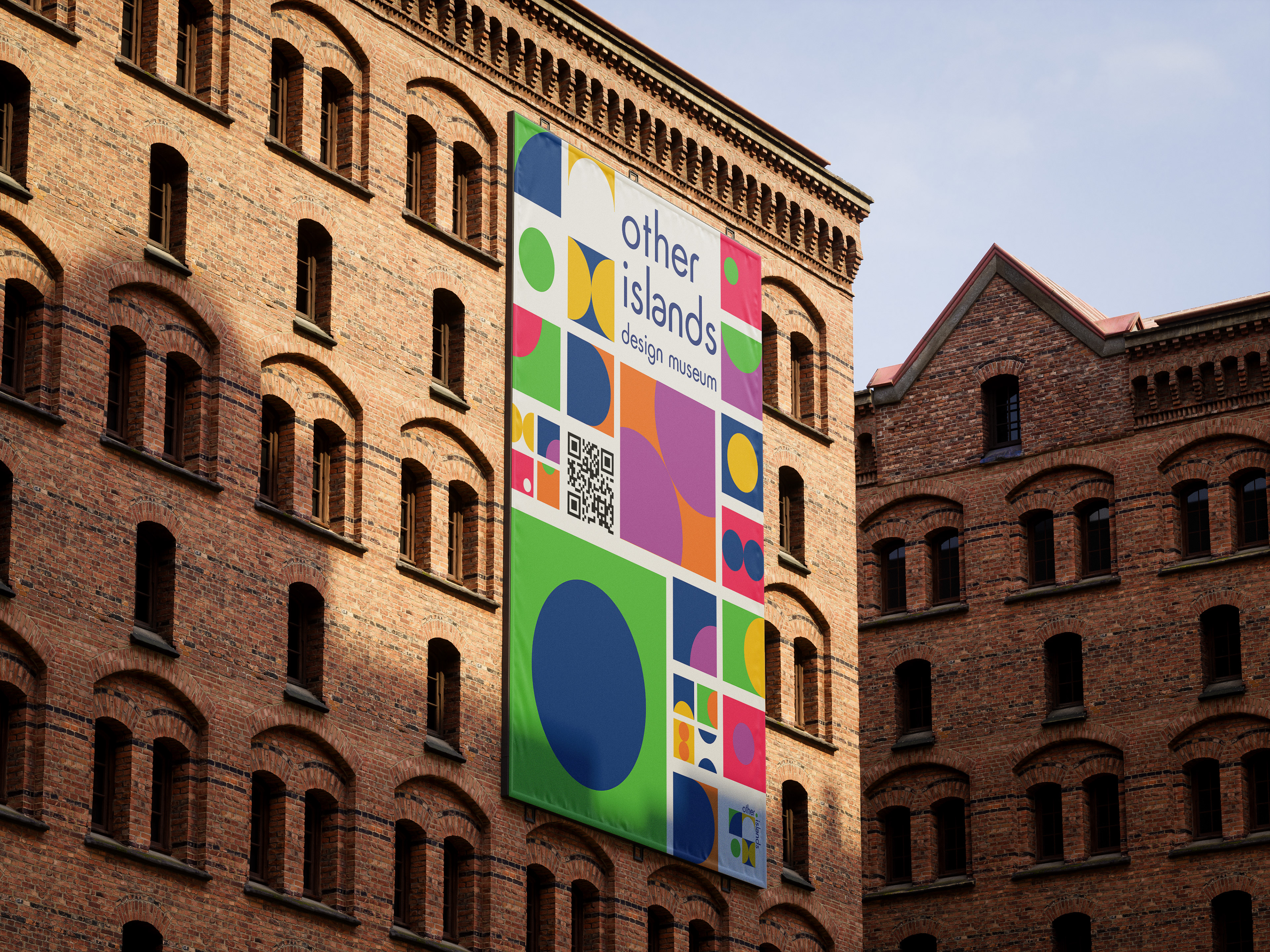
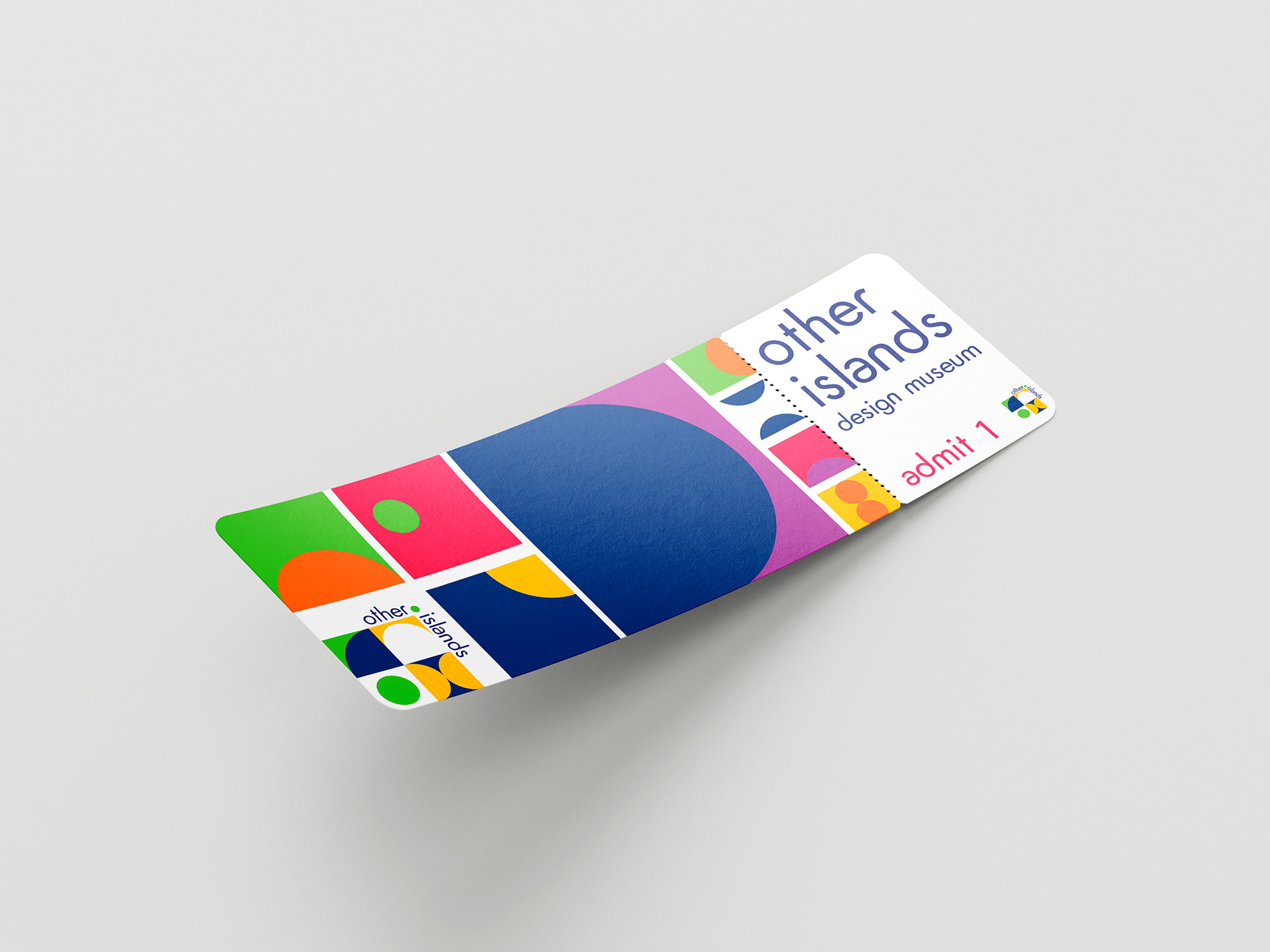
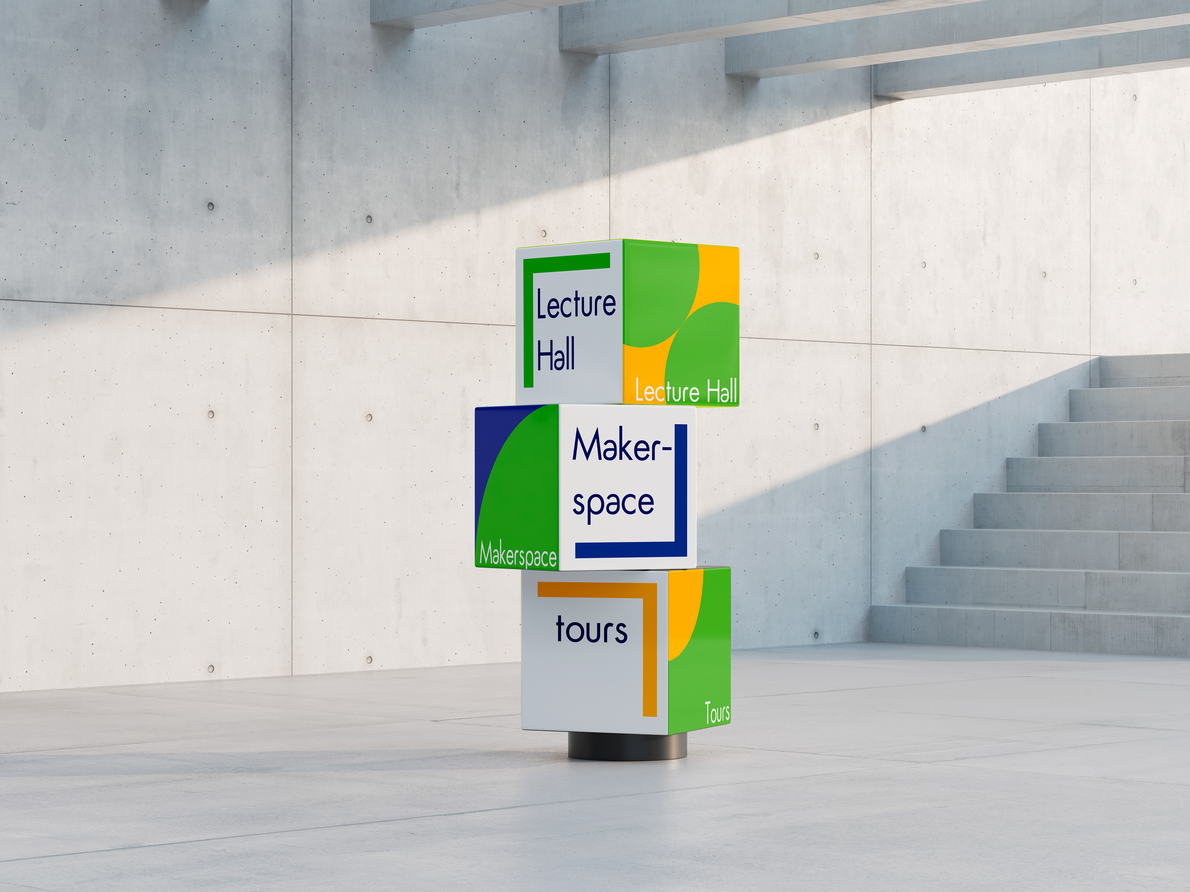
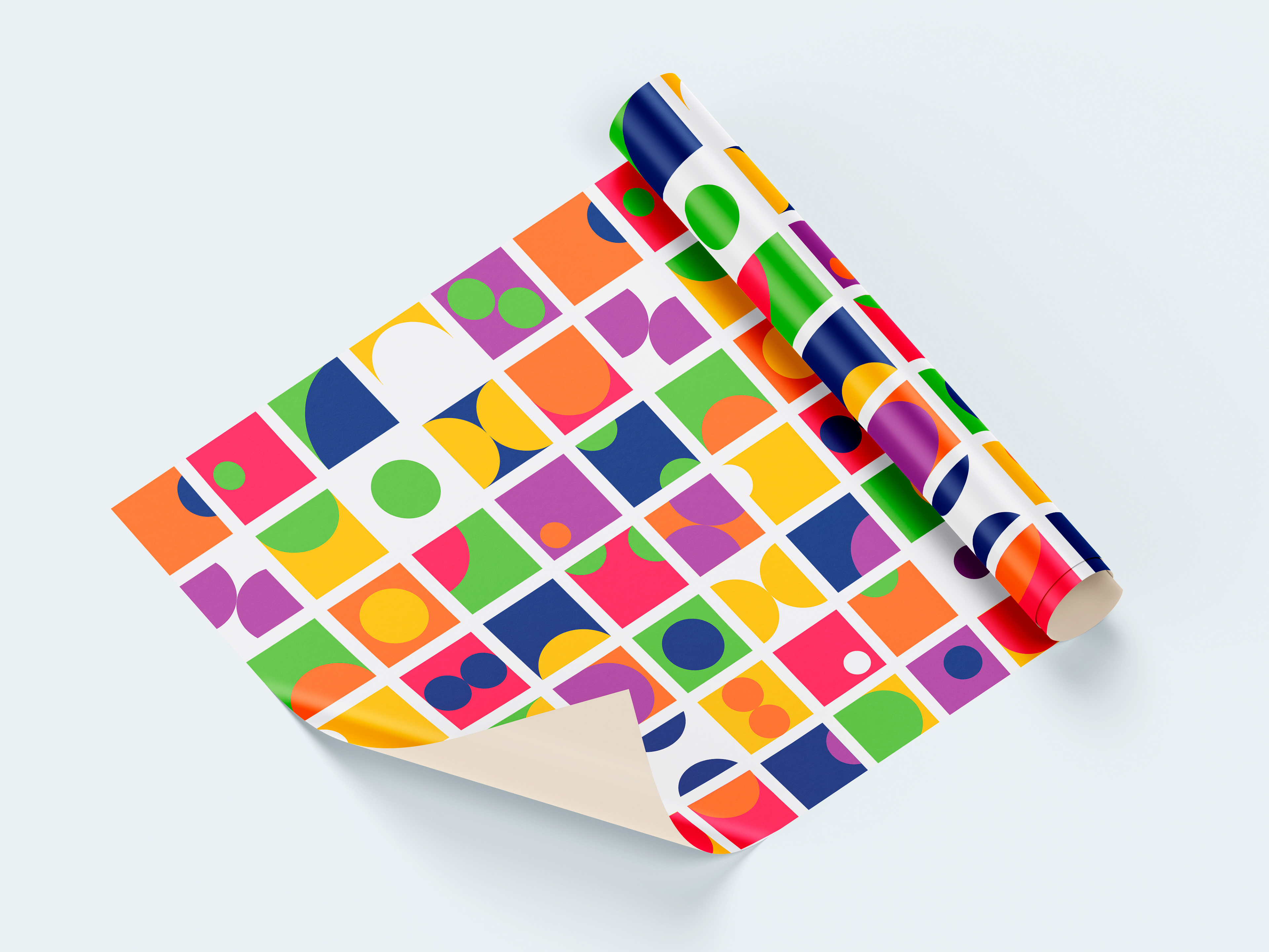
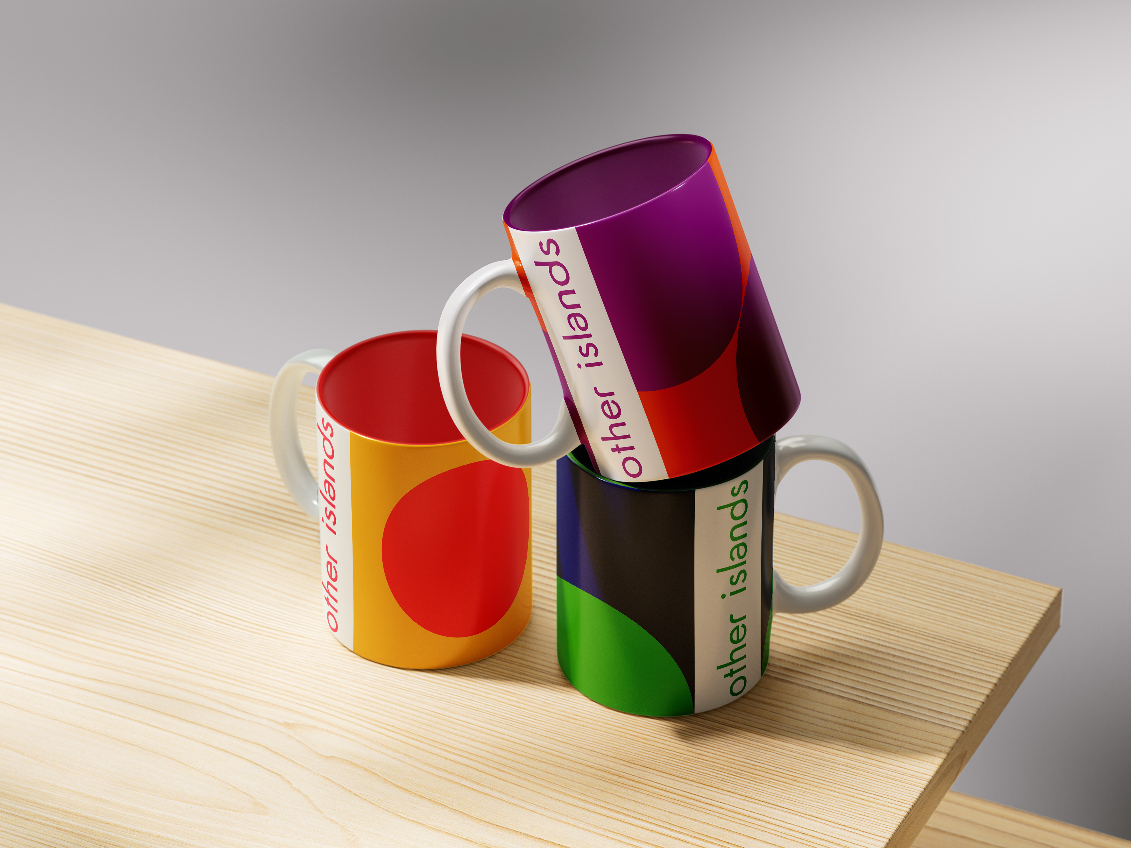
The final branding system for Other Islands conveys creativity, inclusivity, and the transformative power of design. The modular logo, vibrant colors, and geometric typography work together to create a cohesive identity. Throughout the process, I prioritized accessibility and engagement, ensuring the design system could flexibly extend across digital platforms, signage, and educational materials, creating a welcoming and dynamic brand experience for visitors from all “islands” of life.